App5 : Yacht Charter - Learning New Widgets
Table Of Content :
- Stack
- children : List<Widget>
- alignment : AlignmentGeometry
- fit : StackFit
- DropdownButton
- disabledHint : Widget
- dropdownColor : Color
- hint : Widget
- icon : Widget
- items : List<DropdownMenuItem<T>>
- itemHeight : Double
- onChanged :
- style : TextStyle
- underline : Widget
- value :
- Slider
- activeColor : Color
- divisions : int
- inactiveColor : Color
- label : String
- max : double
- min : double
- onChanged :
- value : double
- CheckBox
- activeColor : Color
- checkColor : Color
- onChanged :
- value : bool
- Positioned
- child : Widget
- width : double
- height : double
- bottom : double
- left : double
- right : double
- top : double
A widget that positions its children relative to the edges of its box.
This class is useful if you want to overlap several children in a simple way, for example having some text
and an image, overlaid with a gradient and a button attached to the bottom.
Some properties of Stack Class:
The widgets below this widget in the tree.
How to align the non-positioned and partially-positioned children in the stack.
How to size the non-positioned children in the stack.
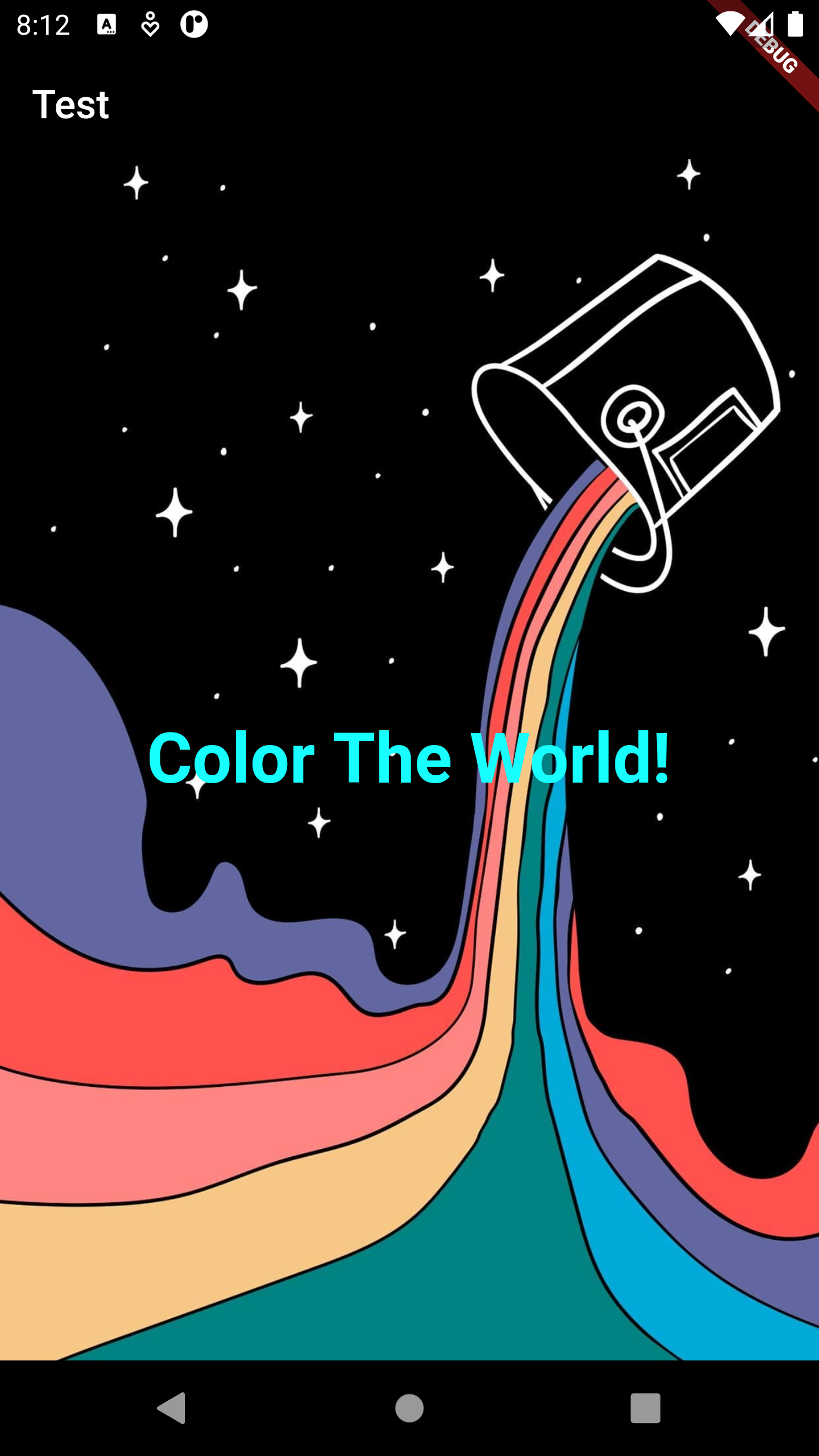
Example :
Stack(
fit: StackFit.expand,
children: [
Image.network(
"https://www.ideasdonuts.com/wp-content/uploads/2021/06/Cute-and-Pleasing-HD-Phone-Background-18.jpg",
fit: BoxFit.cover,
),
Center(
child: Text(
"Color The World!",
style: TextStyle(
color: Colors.cyanAccent,
fontSize: 35,
fontWeight: FontWeight.bold),
),
)
],
)
A material design button for selecting from a list of items.
A dropdown button lets the user select from a number of items. The button shows the currently selected item
as well as an arrow that opens a menu for selecting another item.
Some properties of DropdownButton Class:
A preferred placeholder widget that is displayed when the dropdown is disabled.
The background color of the dropdown.
A placeholder widget that is displayed by the dropdown button.
The widget to use for the drop-down button's icon.
The list of items the user can select.
If null, then the menu item heights will vary according to each menu item's intrinsic height.
Called when the user selects an item.
The text style to use for text in the dropdown button and the dropdown menu that appears when you tap the button.
The widget to use for drawing the drop-down button's underline.
The value of the currently selected DropdownMenuItem.
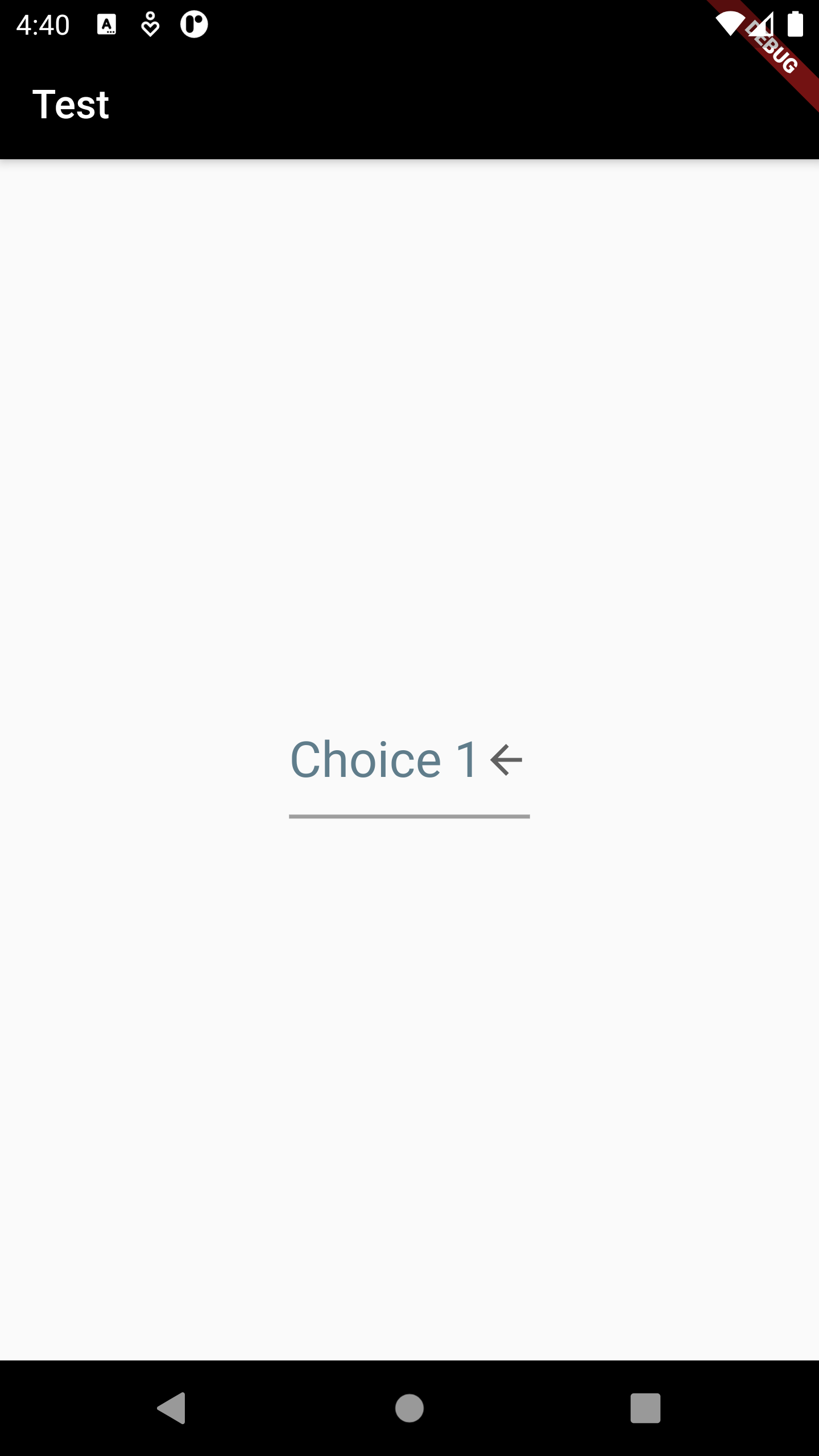
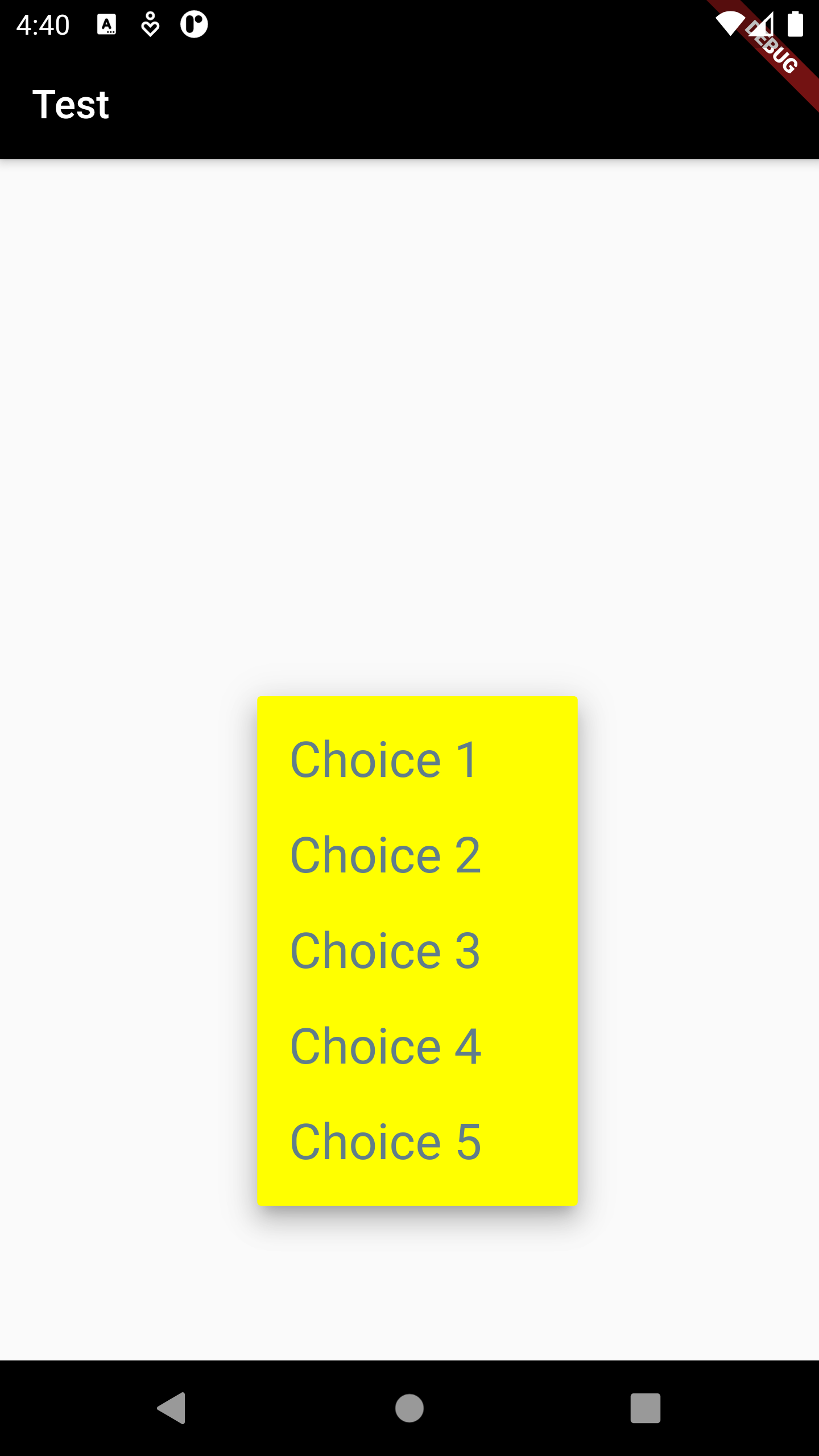
Example :
DropdownButton<String>(
value: _choice,
underline: Container(
height: 2,
color: Colors.grey,
),
onChanged: (String? newValue) {
setState(() {
_choice = newValue!;
});
},
style: TextStyle(color: Colors.blueGrey, fontSize: 25),
icon: Icon(Icons.arrow_back),
dropdownColor: Colors.yellowAccent,
itemHeight: 75,
items: ['Choice 1', 'Choice 2', 'Choice 3', 'Choice 4', 'Choice 5']
.map((value) {
return DropdownMenuItem(
value: value,
child: Text(
value,
),
);
}).toList(),
)
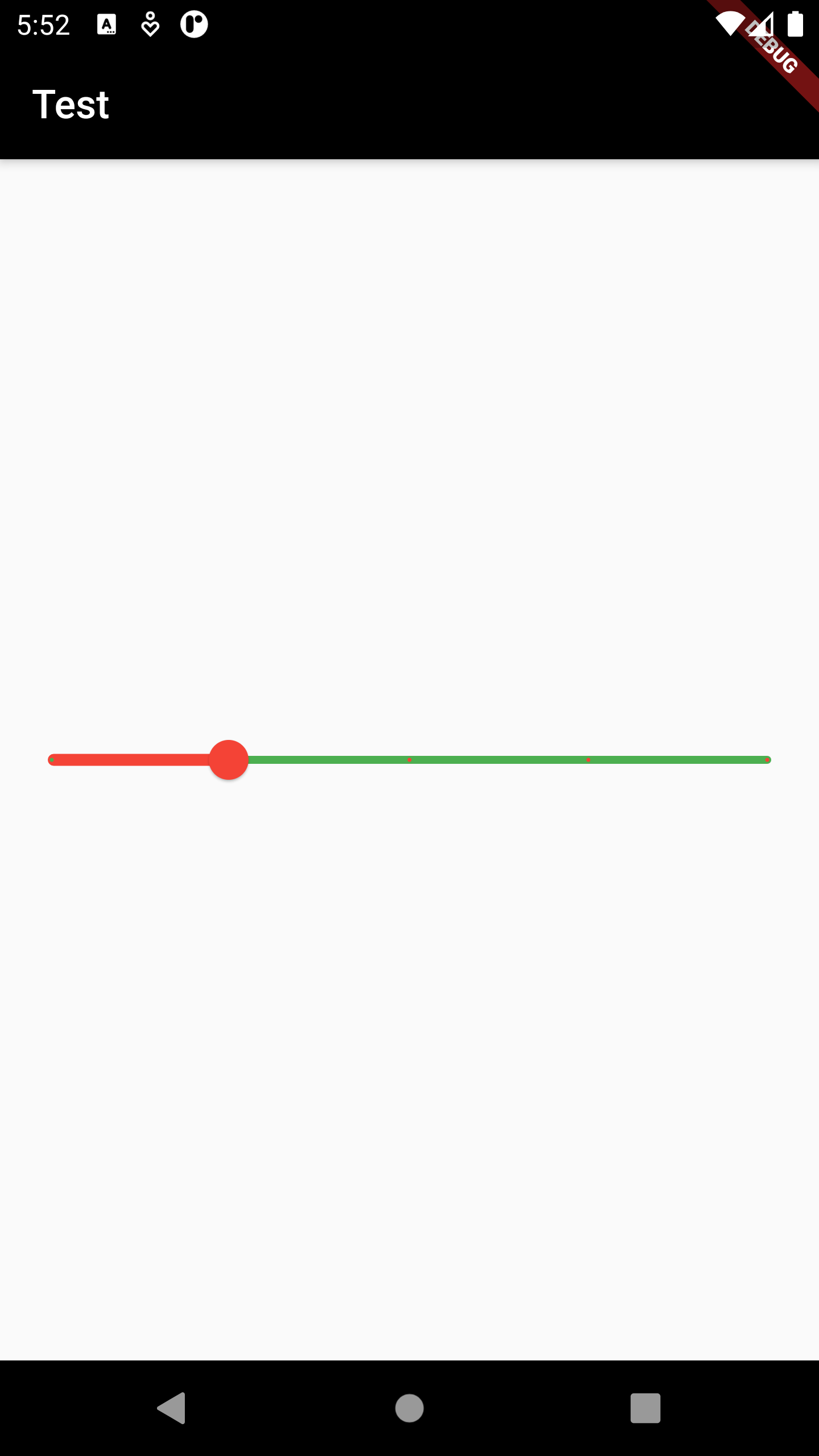
Used to select from a range of values.
Some properties of Slider Class:
The color to use for the portion of the slider track that is active.
The number of discrete divisions.
The color for the inactive portion of the slider track.
A label to show above the slider when the slider is active.
The maximum value the user can select.
The minimum value the user can select.
Called during a drag when the user is selecting a new value for the slider by dragging.
The currently selected value for this slider.
Example :
Slider(
value: _value,
min: 1,
max: 5,
divisions: 4,
label: "value : $_value",
onChanged: (val) {
setState(() {
_value = val;
});
},
activeColor: Colors.red,
inactiveColor: Colors.green,
)
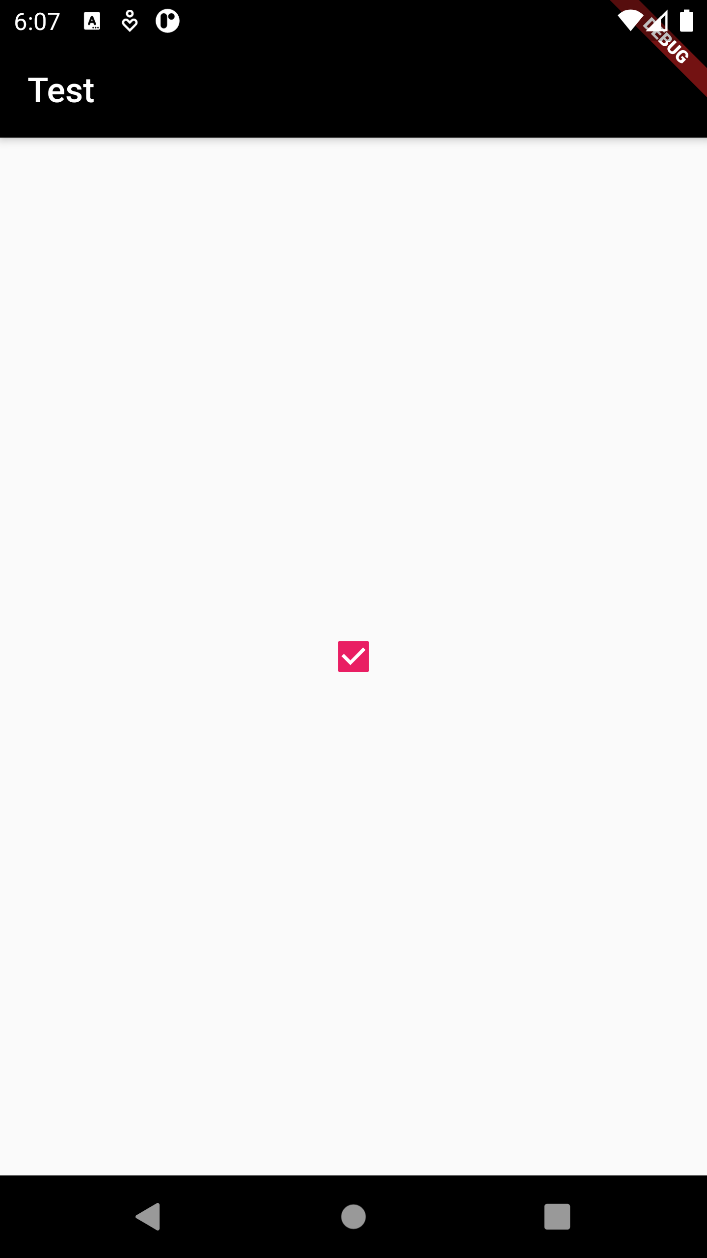
A checkbox is a type of input component which holds the Boolean value. It is a GUI element that allows the user to choose multiple options from several selections.
Some properties of CheckBox Class:
The color to use when this checkbox is checked.
The color to use for the check icon when this checkbox is checked.
Called when the value of the checkbox should change.
The currently selected value for this slider.
Example :
Checkbox(
value: _value,
onChanged: (val) {
setState(() {
_value = val;
});
},
activeColor: Colors.pink,
checkColor: Colors.white,
)

A widget that controls where a child of a Stack is positioned.
A Positioned widget must be a descendant of a Stack, and the path from the Positioned widget to its
enclosing Stack must contain only StatelessWidgets or StatefulWidgets.
Some properties of Positioned Class:
The widget below this widget in the tree.
The child's width.
The child's height.
The distance that the child's bottom edge is inset from the bottom of the stack.
The distance that the child's left edge is inset from the left of the stack.
The distance that the child's right edge is inset from the right of the stack.
The distance that the child's top edge is inset from the top of the stack.
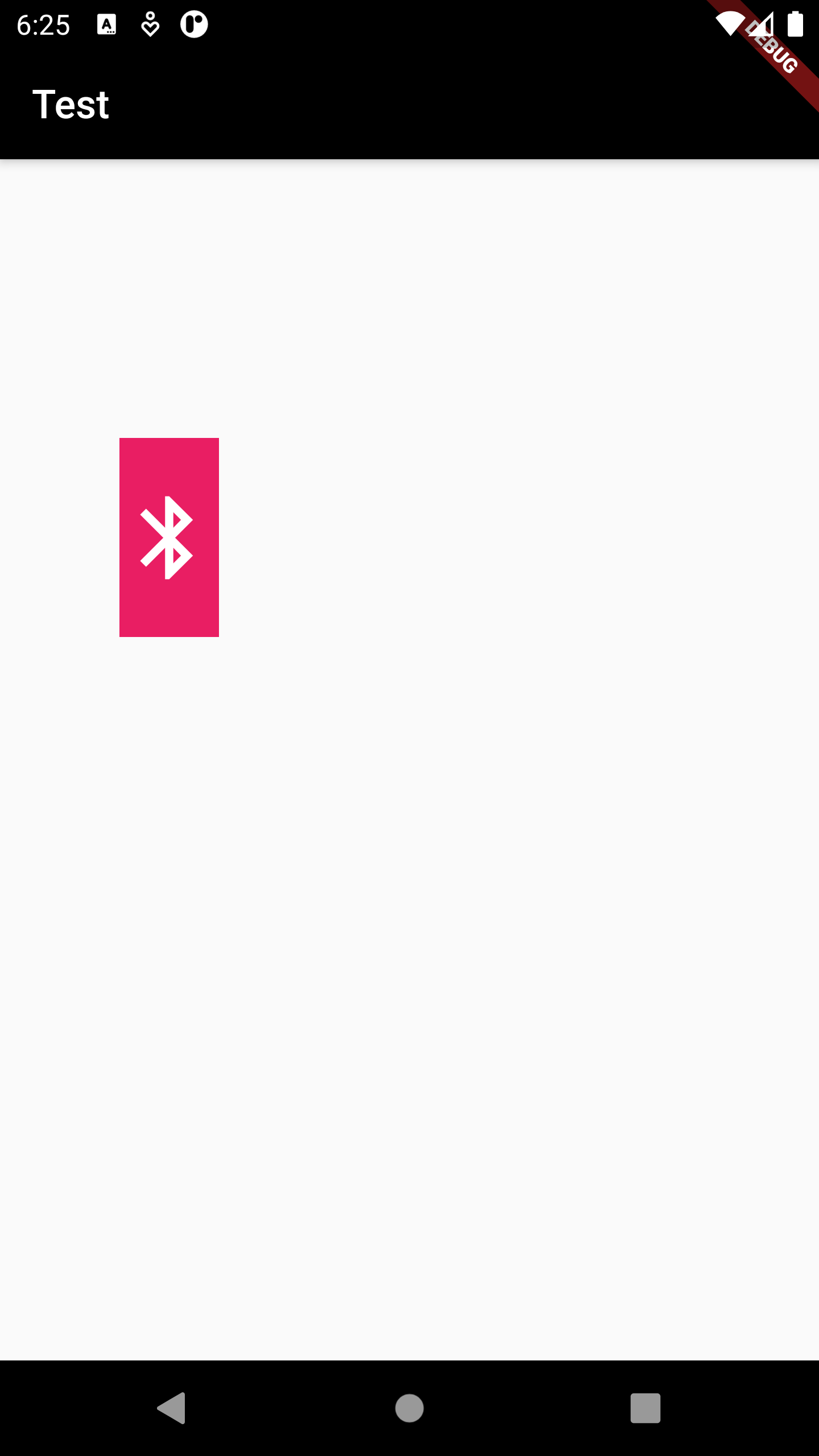
Example :
Stack(
children: [
Positioned(
width: 50,
height: 100,
top: 140,
left: 60,
child: Container(
color: Colors.pink,
child: Icon(
Icons.bluetooth,
color: Colors.white,
size: 50,
),
))
],
)
