App3 : Simple Calculator - Learning New Widgets
Table Of Content :
- TextButton
- child : Widget
- style : ButtonStyle
- onPressed : VoidCallback (that have no arguments and return no data )
- FittedBox
- child : Widget
- fit : BoxFit
- alignment : AlignmentGeometry
- Padding
- child : Widget
- padding : EdgeInsetsGeometry
- Align
- child : Widget
- alignment : AlignmentGeometry
- RichText
- children : List<Widget>
- text : InlineSpan
- maxLines : Int
A TextButton widget is just a text label displayed on a zero elevation Material widget. By default, it
doesn’t have visible borders and reacts to touches by filling with a background color.
Note that FlatButton have been replaced by TextButton,
Some properties of TextButton Class:
Typically the button's label.
Customizes this button's appearance.
Called when the button is tapped or otherwise activated.
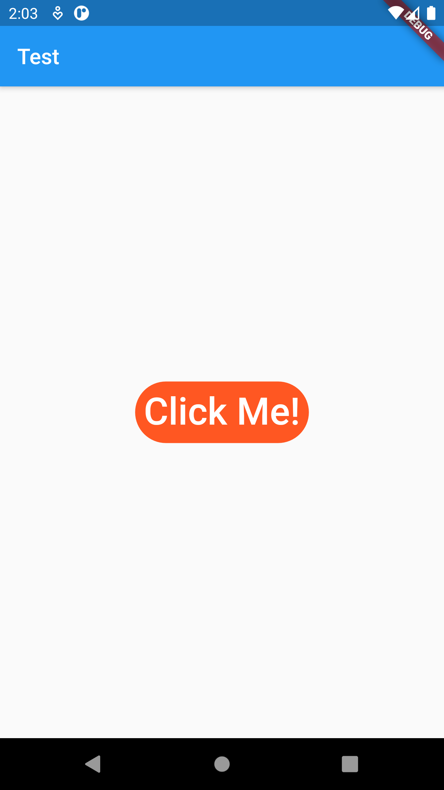
Example :
TextButton(
child: Text(
"Click Me!",
style: TextStyle(fontSize: 35),
),
onPressed: () {
print("Clicked !");
},
style: TextButton.styleFrom(
backgroundColor: Colors.deepOrange,
primary: Colors.white,
shape: RoundedRectangleBorder(
borderRadius: BorderRadius.circular(50.0),
)),
),
A widget that displays an image.
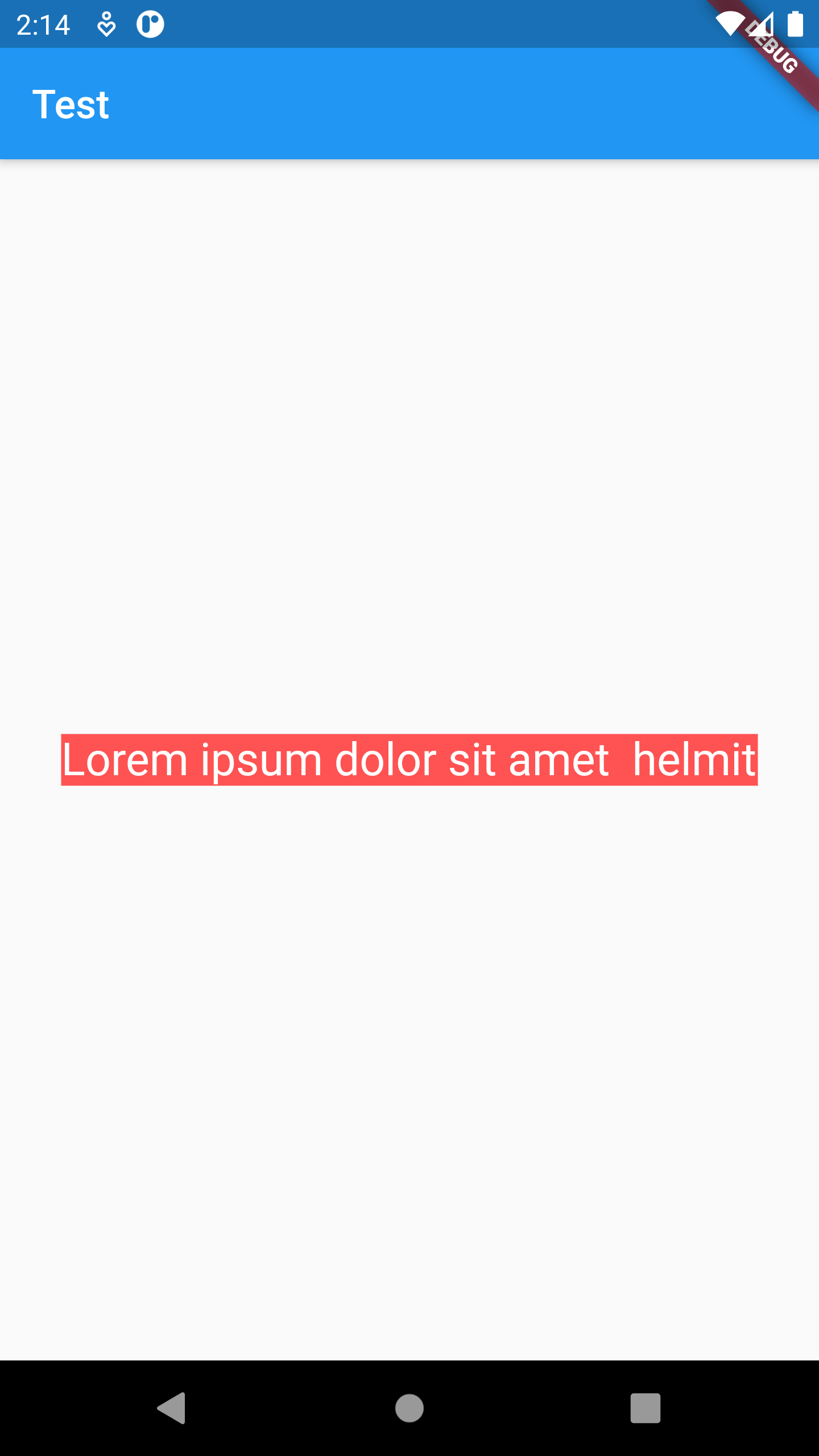
Scales and positions its child within itself according to fit.
Some properties of FittedBox Class:
The widget below this widget in the tree.
How to inscribe the child into the space allocated during layout.
How to align the child within its parent's bounds.
Example
Container(
width: 350,
color: Colors.redAccent,
child: FittedBox(
fit: BoxFit.scaleDown,
child: Text(
"Lorem ipsum dolor sit amet helmit",
style: TextStyle(fontSize: 26, color: Colors.white),
),
),
)
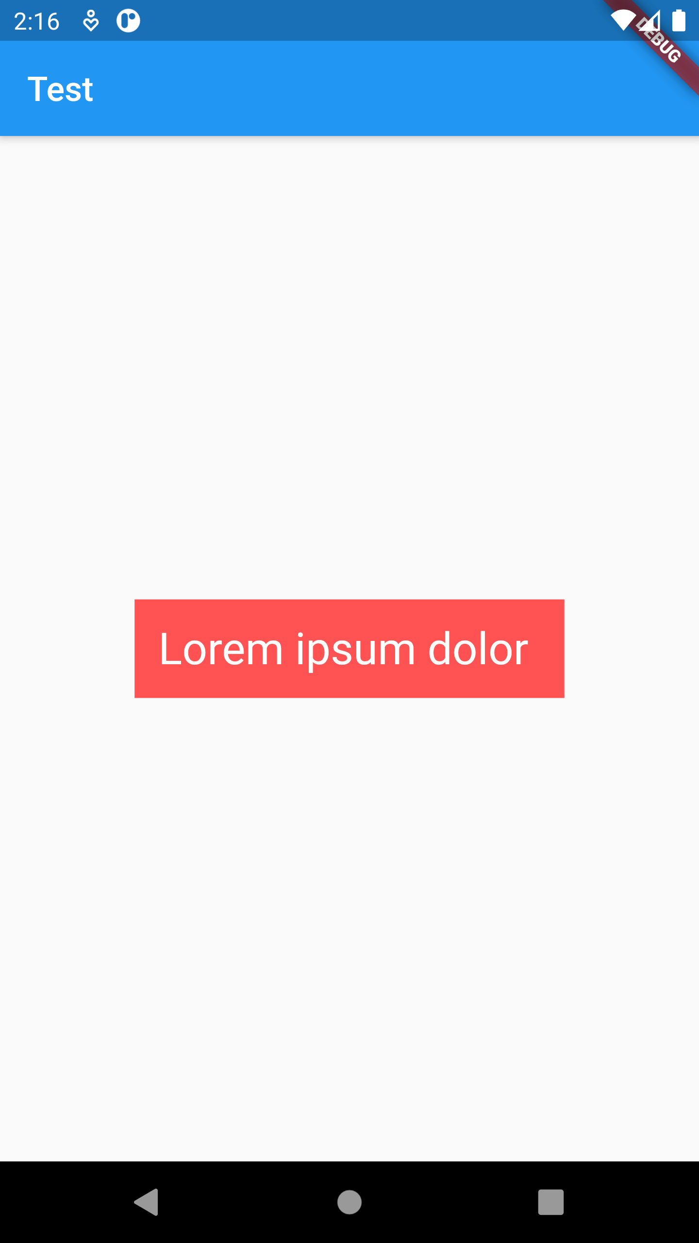
A widget that insets its child by the given padding.
Some properties of Padding Class:
The widget below this widget in the tree.
The amount of space by which to inset the child.
Example
Container(
color: Colors.redAccent,
child: Padding(
padding: const EdgeInsets.all(14.0),
child: Text(
"Lorem ipsum dolor ",
style: TextStyle(fontSize: 26, color: Colors.white),
),
),
)
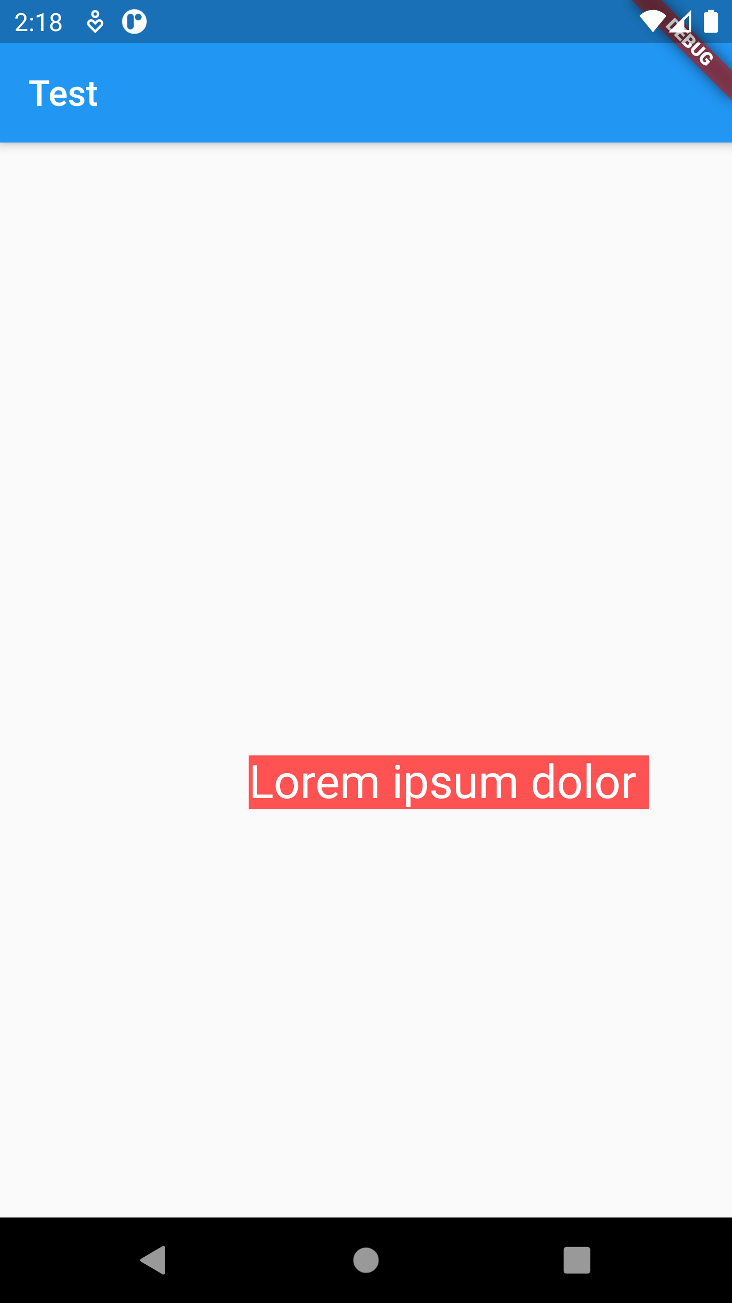
A widget that aligns its child within itself and optionally sizes itself based on the child's size.
Some properties of Padding Class:
The widget below this widget in the tree.
How to align the child.
Example
Align(
alignment: Alignment(0.5, 0.2),
child: Container(
color: Colors.redAccent,
child: Text(
"Lorem ipsum dolor ",
style: TextStyle(fontSize: 26, color: Colors.white),
),
),
),
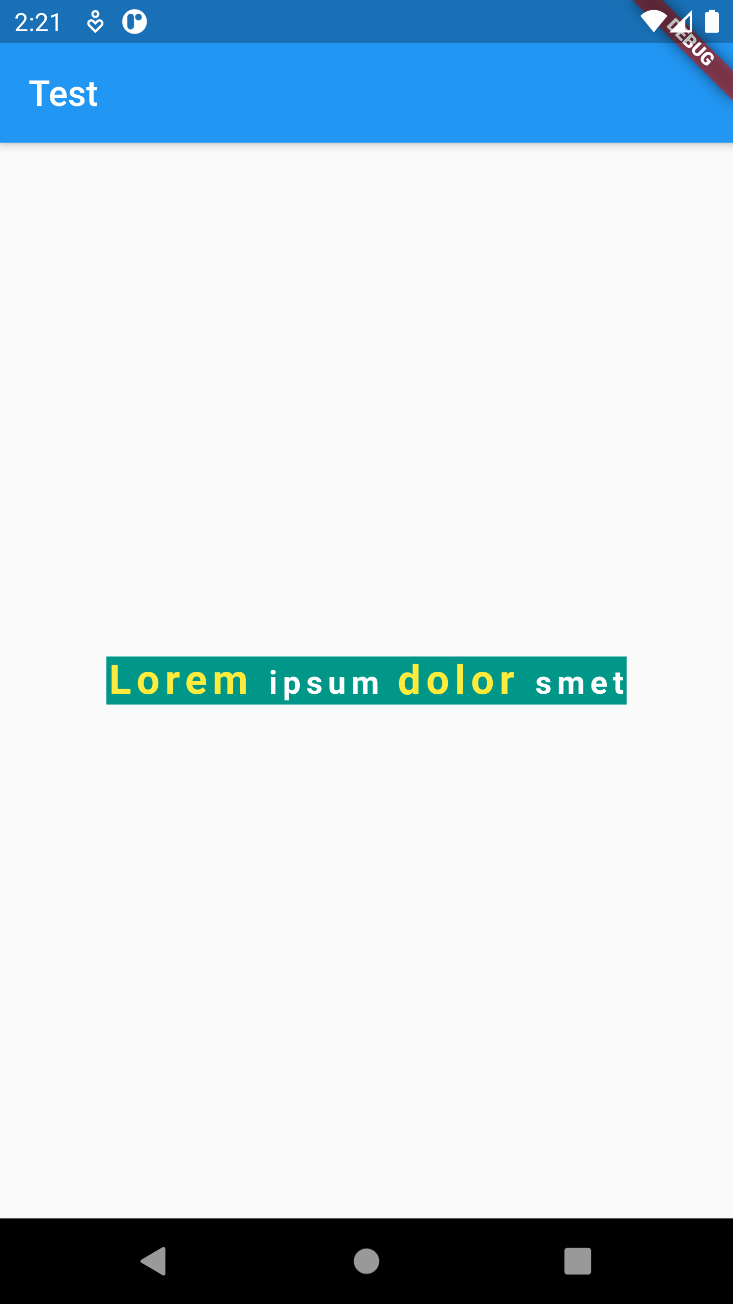
The RichText widget displays text that uses multiple different styles. The text to display is described using a tree of TextSpan objects, each of which has an associated style that is used for that subtree. The text might break across multiple lines or might all be displayed on the same line depending on the layout constraints.
Some properties of RichText Class:
The widgets below this widget in the tree.
The text to display in this widget.
An optional maximum number of lines for the text to span, wrapping if necessary. If the text exceeds the given number of lines, it will be truncated according to overflow.
Example
Container(
color: Colors.teal,
child: RichText(
text: TextSpan(
style: TextStyle(
letterSpacing: 3,
fontSize: 18,
fontWeight: FontWeight.w700),
children: [
TextSpan(
text: "Lorem ",
style: TextStyle(fontSize: 23, color: Colors.yellow)),
TextSpan(text: "ipsum "),
TextSpan(
text: "dolor ",
style: TextStyle(fontSize: 23, color: Colors.yellow)),
TextSpan(text: 'smet')
]),
),
),
