App11 : Discover Tunisia - Learning New Widgets
Table Of Content :
- DefaultTabController & TabBar
- Scrollbar
- ClipOval
- child : Widget?
- clipBehavior : Clip
- SafeArea
- child : Widget
- left : bool
- maintainBottomViewPadding : bool
- minimum : EdgeInsets
- right : bool
- top : bool
TabBar :A material design widget that displays a horizontal row of tabs.
Typically created as the AppBar.bottom part of an AppBar and in conjunction with a TabBarView.
If a TabController is not provided, then a DefaultTabController ancestor must be provided
instead. The tab
controller's TabController.length must equal the length of the tabs list and the length of the
TabBarView.children list.
Requires one of its ancestors to be a Material widget.
Uses values from TabBarTheme if it is set in the current context.
The TabController for descendant widgets that don't specify one explicitly.
DefaultTabController is an inherited widget that is used to share a TabController with a TabBar
or a
TabBarView. It's used when sharing an explicitly created TabController isn't convenient because
the tab bar
widgets are created by a stateless parent widget or by different parent widgets.
Example :
import 'package:flutter/material.dart';
void main() => runApp(const MyApp());
class MyApp extends StatelessWidget {
const MyApp({Key? key}) : super(key: key);
static const String _title = 'Flutter Code Sample';
@override
Widget build(BuildContext context) {
return const MaterialApp(
title: _title,
home: MyStatelessWidget(),
);
}
}
class MyStatelessWidget extends StatelessWidget {
const MyStatelessWidget({Key? key}) : super(key: key);
@override
Widget build(BuildContext context) {
return DefaultTabController(
initialIndex: 1,
length: 3,
child: Scaffold(
appBar: AppBar(
title: const Text('TabBar Widget'),
bottom: const TabBar(
tabs: <Widget>[
Tab(
icon: Icon(Icons.cloud_outlined),
),
Tab(
icon: Icon(Icons.beach_access_sharp),
),
Tab(
icon: Icon(Icons.brightness_5_sharp),
),
],
),
),
body: const TabBarView(
children: <Widget>[
Center(
child: Text("It's cloudy here"),
),
Center(
child: Text("It's rainy here"),
),
Center(
child: Text("It's sunny here"),
),
],
),
),
);
}
}
A Material Design scrollbar.
To add a scrollbar to a ScrollView, wrap the scroll view widget in a Scrollbar widget.
A scrollbar thumb indicates which portion of a ScrollView is actually visible.
Example :
Scrollbar(
controller: _controllerOne,
isAlwaysShown: true,
child: GridView.builder(
controller: _controllerOne,
itemCount: 120,
gridDelegate:
const SliverGridDelegateWithFixedCrossAxisCount(crossAxisCount: 3),
itemBuilder: (BuildContext context, int index) {
return Center(
child: Text('item $index'),
);
},
),
);
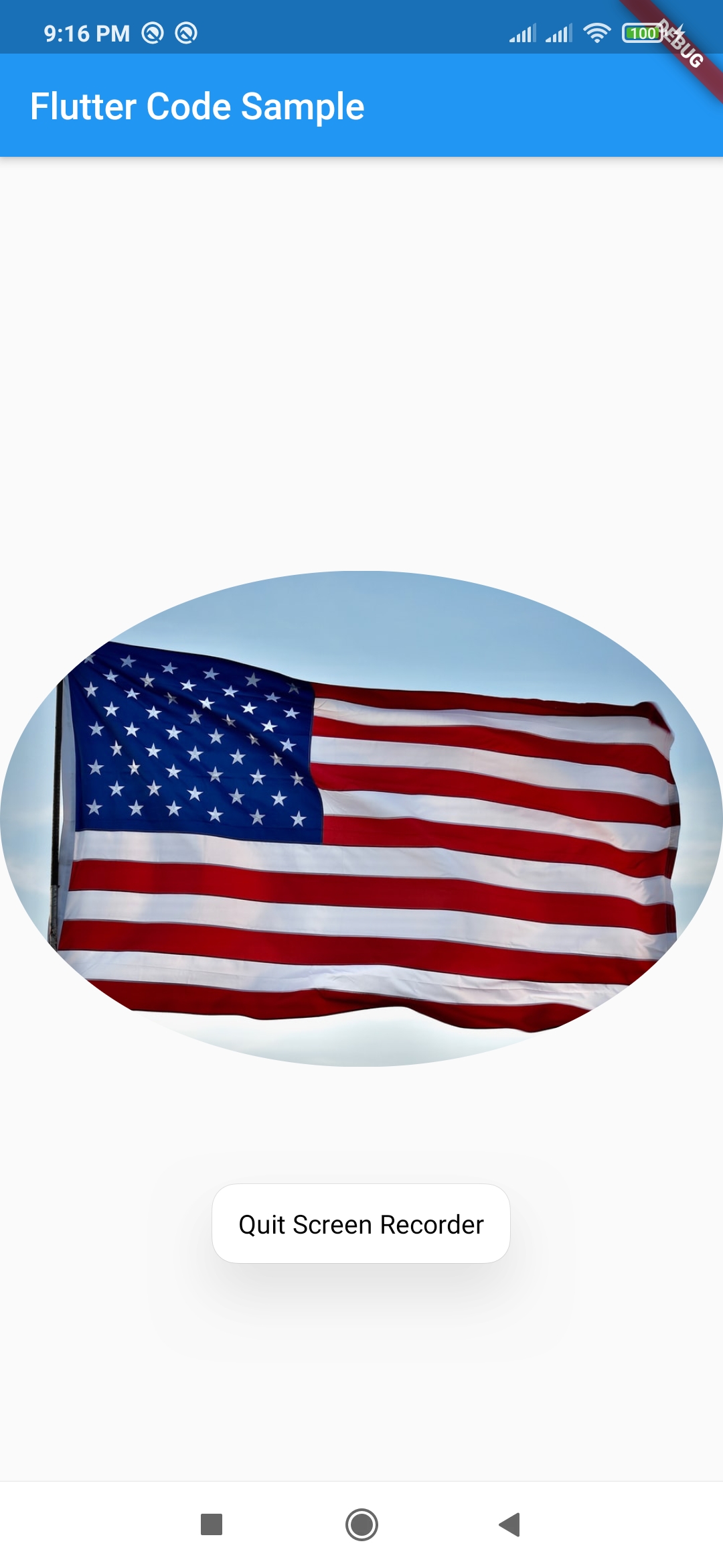
A widget that clips its child using an oval.
By default, inscribes an axis-aligned oval into its layout dimensions and prevents its child
from painting
outside that oval, but the size and location of the clip oval can be customized using a custom
clipper.
Some properties of ClipOval Class:
The widget below this widget in the tree.
Controls how to clip.
Example :
Center(
child:
ClipOval(
child: Image.network(
"https://images.unsplash.com/photo-1626836014893-37663794dca7?ixlib=rb-1.2.1&ixid=MnwxMjA3fDB8MHxzZWFyY2h8MXx8dXMlMjBmbGFnfGVufDB8fDB8fA%3D%3D&w=1000&q=80")),
);

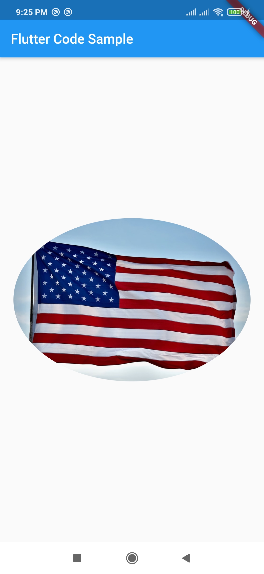
A widget that insets its child by sufficient padding to avoid intrusions by the operating
system.
For example, this will indent the child by enough to avoid the status bar at the top of the
screen.
It will also indent the child by the amount necessary to avoid The Notch on the iPhone X, or
other similar
creative physical features of the display.
When a minimum padding is specified, the greater of the minimum padding or the safe area padding
will be
applied.
Some properties of Table Class:
The widget below this widget in the tree.
Whether to avoid system intrusions on the left.
Specifies whether the SafeArea should maintain the MediaQueryData.viewPadding instead of the MediaQueryData.padding when consumed by the MediaQueryData.viewInsets of the current context's MediaQuery, defaults to false.
This minimum padding to apply.
Whether to avoid system intrusions on the right.
Whether to avoid system intrusions at the top of the screen, typically the system status bar.
Example :
SafeArea(
minimum: EdgeInsets.all(20),
child: Center(
child: ClipOval(
child: Image.network(
"https://images.unsplash.com/photo-1626836014893-37663794dca7?ixlib=rb-1.2.1&ixid=MnwxMjA3fDB8MHxzZWFyY2h8MXx8dXMlMjBmbGFnfGVufDB8fDB8fA%3D%3D&w=1000&q=80")),
),
);
