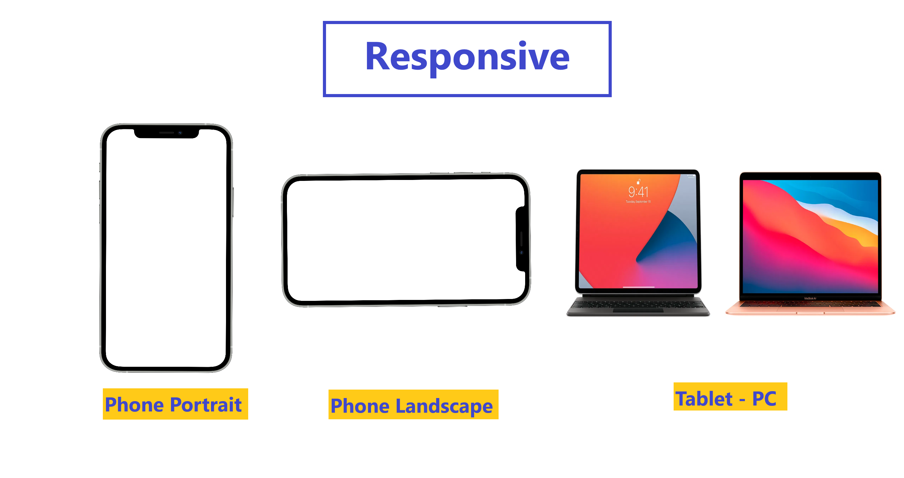
The difference between an adaptive and a responsive app
One of Flutter’s primary goals is to create a framework that allows you to develop apps from a single codebase
that look and feel great on any platform.
This means that your app may appear on screens of many different sizes, from a watch, to a foldable phone with
two screens, to a high def monitor.
Two terms that describe concepts for this scenario are adaptive and responsive. Ideally, you’d want your app to
be both but what, exactly, does this mean? These terms are similar, but they are not the same.
Adaptive and responsive can be viewed as separate dimensions of an app: you can have an adaptive app that is not
responsive, or vice versa. And, of course, an app can be both, or neither.
Responsive :
Typically, a responsive app has had its layout tuned for the available screen size. Often this means (for example), re-laying out the UI if the user resizes the window, or changes the device’s orientation. This is especially necessary when the same app can run on a variety of devices, from a watch, phone, tablet, to a laptop or desktop computer.

Adaptive
Adapting an app to run on different device types, such as mobile and desktop, requires dealing with mouse and keyboard input, as well as touch input. It also means there are different expectations about the app’s visual density, how component selection works (cascading menus vs bottom sheets, for example), using platform-specific features (such as top-level windows), and more.
Example :
| Android | iOS |
|---|---|
| Material-Design Look | Cupertino Look |
| Android Animations | iOS Animations |
| Android Fonts | iOS Fonts |
| Material-Design Slider | CupertinoSlider |
|---|---|

|

|
| AppBar | CupertinoNavigationBar |
 |
 |