App1 : Elon Musk’s Resume - Learning New Widgets
Table Of Content :
- Scaffold
- appBar : PreferredSizeWidget (AppBar)
- body : Widget
- backgroundColor : Color
- AppBar
- title : Widget
- backgroundColor : Color
- Container
- child : Widget
- height / width / margin / padding :
- alignment : Alignment
- decoration : Decoration (BoxDecoration)
- color : Color
- Text
- data : String
- textAlign : TextAlign
- style : TextStyle
- Image
- alignment : Alignment
- height / width
- fit : BoxFit
- Icon
- icon : IconData (Icons)
- color : Color
- size : Double
- Column
- children : List<Widget>
- crossAxisAlignment CrossAxisAlignment
- mainAxisAlignment MainAxisAlignment
- Row
- children : List<Widget>
- crossAxisAlignment CrossAxisAlignment
- mainAxisAlignment MainAxisAlignment
- SizedBox
- child : Widget
- height / width
- SingleChildScrollView
- child : Widget
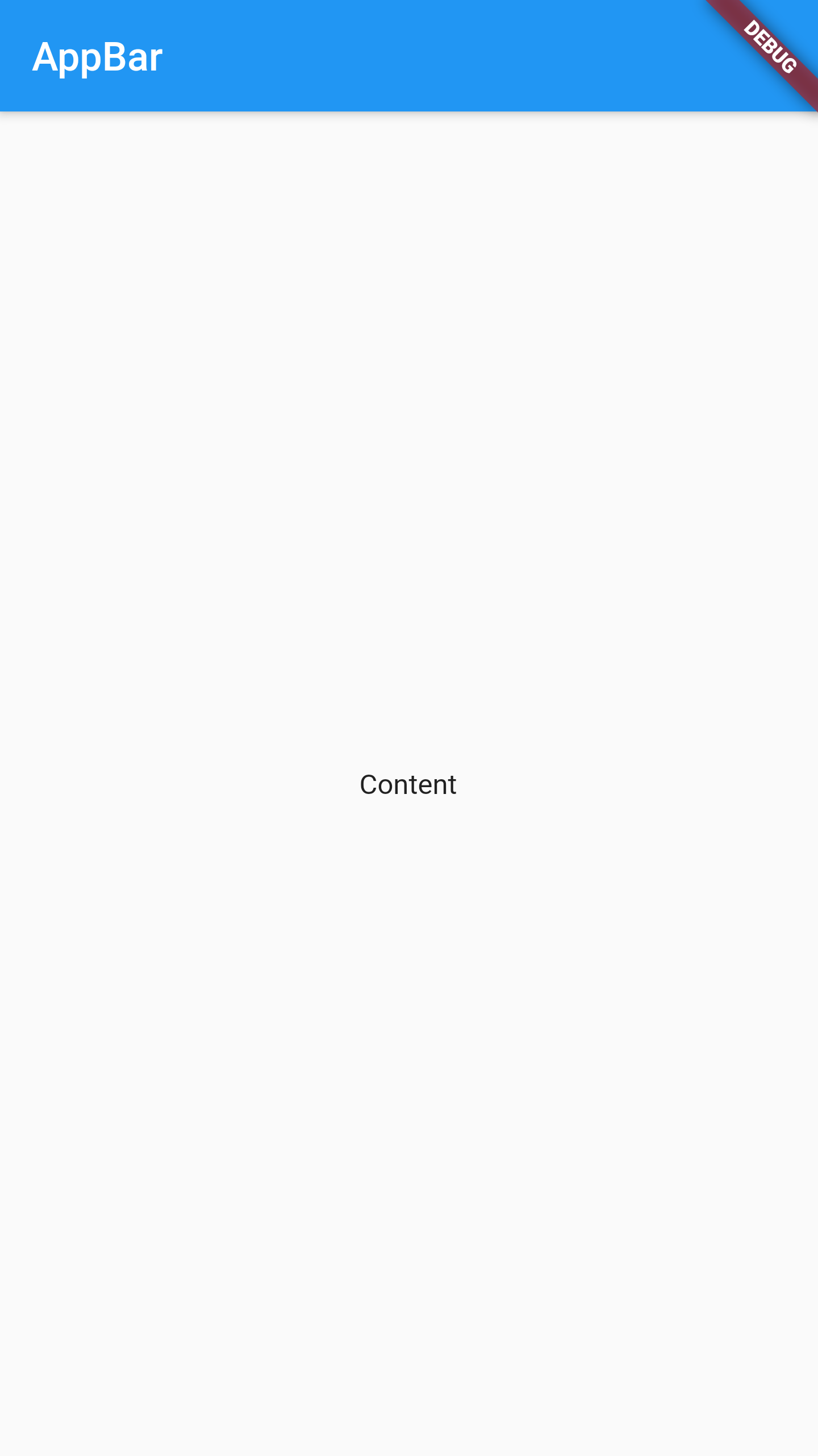
Scaffold is a class in flutter which provides many widgets or we can say APIs like Drawer, FloatingActionButton, AppBar etc. Scaffold will expand or occupy the whole device screen. It will occupy the available space. Scaffold will provide a framework to implement the basic material design layout of the application.
Some properties of Scaffold Class:
It displays a horizontal bar which mainly placed at the top of the Scaffold. appBar uses the widget AppBar which has its own properties like elevation, title, brightness, etc.
It will display the main or primary content in the Scaffold. It is below the appBar and under the floatingActionButton. The widgets inside the body are at the left-corner by default.
Used to set the color of the whole Scaffold widget.
We will see more properties in the next apps.
Example :
Scaffold(
appBar: AppBar(
title: Text("AppBar"),
),
body: Center(child: Text('Content'),),
);
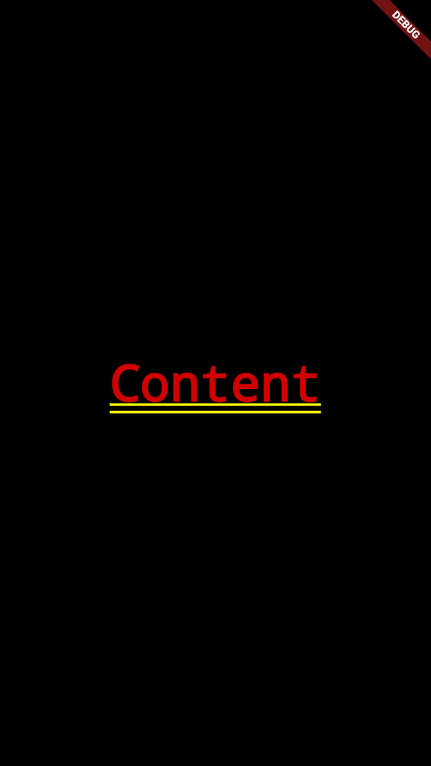
Without Scaffold :
AppBar is usually the topmost component of the app (or sometimes the bottom-most), it contains the toolbar and some other common action buttons. As all the components in a flutter application is a widget or a combination of widgets. So AppBar is also a built-in class or widget in flutter which gives the functionality of the AppBar out of the box.
Some properties of AppBar Class:
This property usually takes in the main widget as a parameter to be displayed in the AppBar.
This property is used to add colors to the background of the Appbar.
We will see more properties in the next apps.
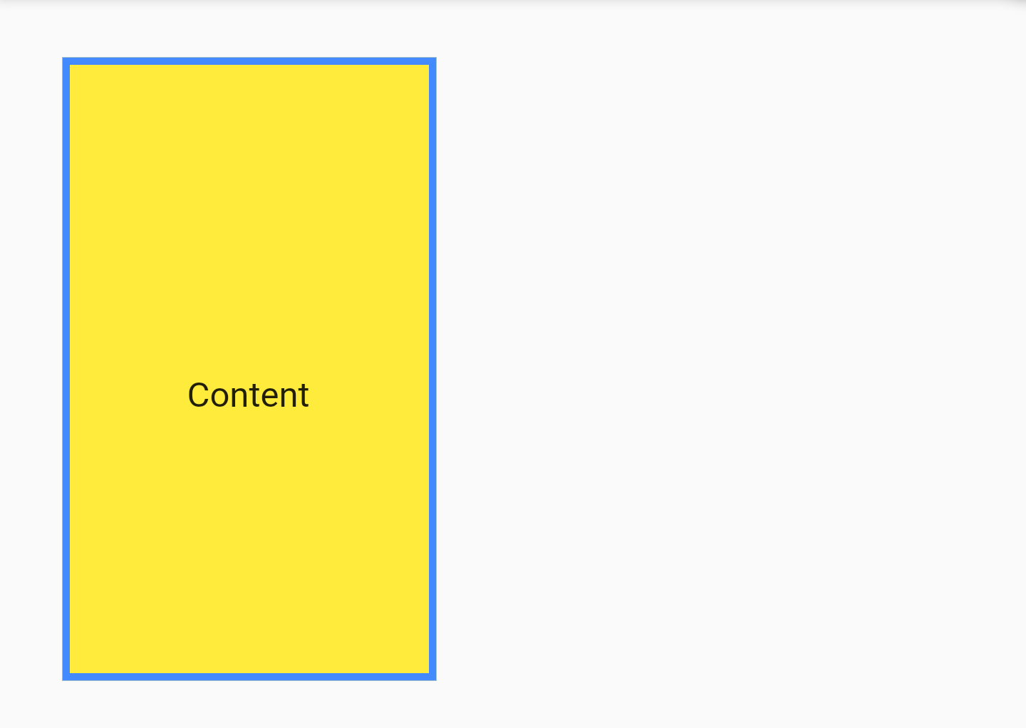
A convenience widget that combines common painting, positioning, and sizing widgets. A Container class can be used to store one or more widgets and position it on the screen according to our convenience. Basically a container is like a box to store contents.
Some properties of Container Class:
The child Widget contained by the container.
Check Box Model .
Align the child within the container. We can align in different ways: bottom, bottom center, left, right, etc.
The decoration property is used to decorate the box(e.g. give a border). This paints behind the child. Whereas foregroundDecoration paints in front of a child. Let us give a border to the container. But, both color and border color cannot be given.
The color to paint behind the child.
We will see more properties in the next apps.
Example :
Container(
child: Text("Content"),
height: 250,
width: 150,
margin: EdgeInsets.all(25),
padding: EdgeInsets.only(top: 20),
alignment: Alignment.center,
decoration: BoxDecoration(
border: Border.all(color: Colors.blueAccent, width: 3),
color: Colors.yellow,
),
),
The Text widget displays a string of text with single style. The string might break across multiple lines or might all be displayed on the same line depending on the layout constraints.
Some properties of Text Class:
The text to display.
How the text should be aligned horizontally.
The style to use for this text.
We will see more properties in the next apps.
Example :
Text(
"Text Content",
textAlign: TextAlign.center,
style: TextStyle(
color: Color.fromRGBO(100, 100, 215, 0.9),
fontSize: 25,
fontStyle: FontStyle.italic,
fontWeight: FontWeight.bold,
letterSpacing: 10),
),

A widget that displays an image.
First Method : Image.network( address )
With the image address, the image can be added to the code.
Some properties of Image Class:
How to align the image within its bounds.
How to inscribe the image into the space allocated during layout. (contain / cover / fill ... check BoxFit)
We will see more methods and properties in the next apps.
Example
Image.network(
"https://downloadwap.com/thumbs2/wallpapers/p2/2019/fcelebs/48/34caf5ef13647831.jpg",
width: 300,
height: 200,
fit: BoxFit.contain,
)
Icon class in Flutter is used to show specific icons in our app. Instead of creating an image for our icon, we can simply use the Icon class for inserting an icon in our app.
Some properties of Icon Class:
The icon to display.
The color to use when drawing the icon.
The size of the icon in logical pixels.
Example
Icon(
Icons.email,
color: Colors.red,
size: 250,
)

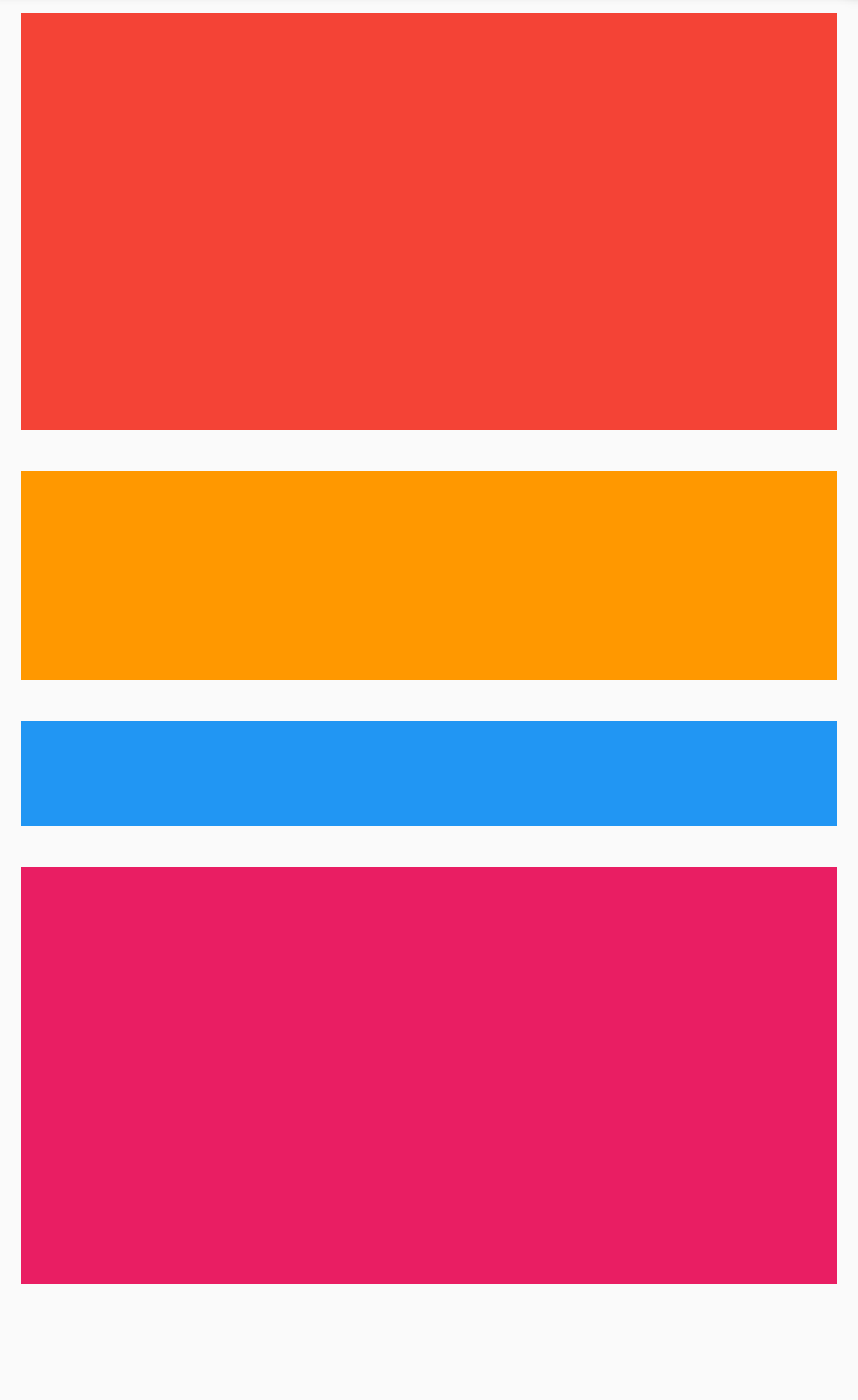
A widget that displays its children in a vertical array.
The Column widget does not scroll (and in general it is considered an error to have more children in a
Column than will fit in the available room).
Some Properties of Column Class:
The list of widgets to display inside the the Column widget.
How the children should be placed along the cross axis.
How the children should be placed along the main axis.
We will see more properties in the next apps.
Example :
Column(
children: [
Container(
height: 200,
color: Colors.red,
margin: EdgeInsets.all(10),
),
Container(
height: 100,
color: Colors.orange,
margin: EdgeInsets.all(10),
),
Container(
height: 50,
color: Colors.blue,
margin: EdgeInsets.all(10),
),
Container(
height: 200,
color: Colors.pink,
margin: EdgeInsets.all(10),
),
],
)
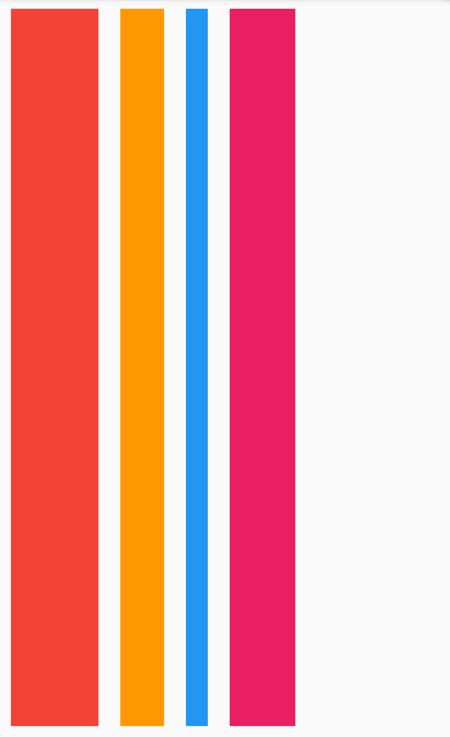
A widget that displays its children in a horizontal array.
The Row widget does not scroll (and in general it is considered an error to have more children in a Row than
will fit in the available room).
Some Properties of Column Class:
The list of widgets to display inside the the row widget.
How the children should be placed along the cross axis.
How the children should be placed along the main axis.
We will see more properties in the next apps.
Example :
Row(
children: [
Container(
width: 80,
color: Colors.red,
margin: EdgeInsets.all(10),
),
Container(
width: 40,
color: Colors.orange,
margin: EdgeInsets.all(10),
),
Container(
width: 20,
color: Colors.blue,
margin: EdgeInsets.all(10),
),
Container(
width: 60,
color: Colors.pink,
margin: EdgeInsets.all(10),
),
],
)
A box with a specified size. If not given a child, SizedBox will try to size itself as close to the specified height and width as possible given the parent's constraints. If height or width is null or unspecified, it will be treated as zero.
Properties of SizedBox Class:
The child Widget contained by the SizedBox.
Example :
SizedBox(
width: 200.0,
height: 300.0,
)
A box in which a single widget can be scrolled.
This widget is useful when you have a single box that will normally be entirely visible, for example a clock
face in a time picker, but you need to make sure it can be scrolled if the container gets too small in one
axis (the scroll direction).
Some Properties of SingleChildScrollView Class:
The child Widget contained by the SingleChildScrollView.
We will see more properties in the next apps.
Example :
SingleChildScrollView(
child: Column(children: [
Icon(...)
Text(....),
Image(...),
Icon(...),
Text(....),
Image(...),
Icon(...),
Text(....),
Image(...),
],),
)