App6 v1 : My Books - Learning New Widgets
Table Of Content :
- IconButton
- icon : Widget
- color : Color
- iconSize : double
- onPressed :
- padding : EdgeInsetsGeometry
- TextField
- controller : TextEditingController
- decoration : InputDecoration
- expands : bool
- keyboardType : TextInputType
- obscureText : bool
- readOnly : bool
- CircleAvatar
- child : Widget
- backgroundImage : ImageProvider<Object>
- backgroundColor : Color
- foregroundColor : Color
- radius : double
- ListTile
- leading : Widget
- title : Widget
- subtitle : Widget
- trailing : Widget
- isThreeLine : bool
- Card
- child : Widget
- elevation : double
- shadowColor : Color
- shape : ShapeBorder
- margin : EdgeInsetsGeometry
- Flexible
- child : Widget
- fit : FlexFit
- flex : int
- ListView
-
The default constructor takes an explicit List <Widget> of children. This constructor is appropriate for list views with a small number of children because constructing the List requires doing work for every child that could possibly be displayed in the list view instead of just those children that are actually visible.
-
The ListView.builder constructor takes an IndexedWidgetBuilder, which builds the children on demand. This constructor is appropriate for list views with a large (or infinite) number of children because the builder is called only for those children that are actually visible.
-
The ListView.separated constructor takes two IndexedWidgetBuilders: itemBuilder builds child items on demand, and separatorBuilder similarly builds separator children which appear in between the child items. This constructor is appropriate for list views with a fixed number of children.
-
The ListView.custom constructor takes a SliverChildDelegate, which provides the ability to customize additional aspects of the child model. For example, a SliverChildDelegate can control the algorithm used to estimate the size of children that are not actually visible.
- BottomNavigationBar
- items : List<BottomNavigationBarItem>
- currentIndex : int
- selectedItemColor : Color
- onTap :
- selectedLabelStyle : TextStyle
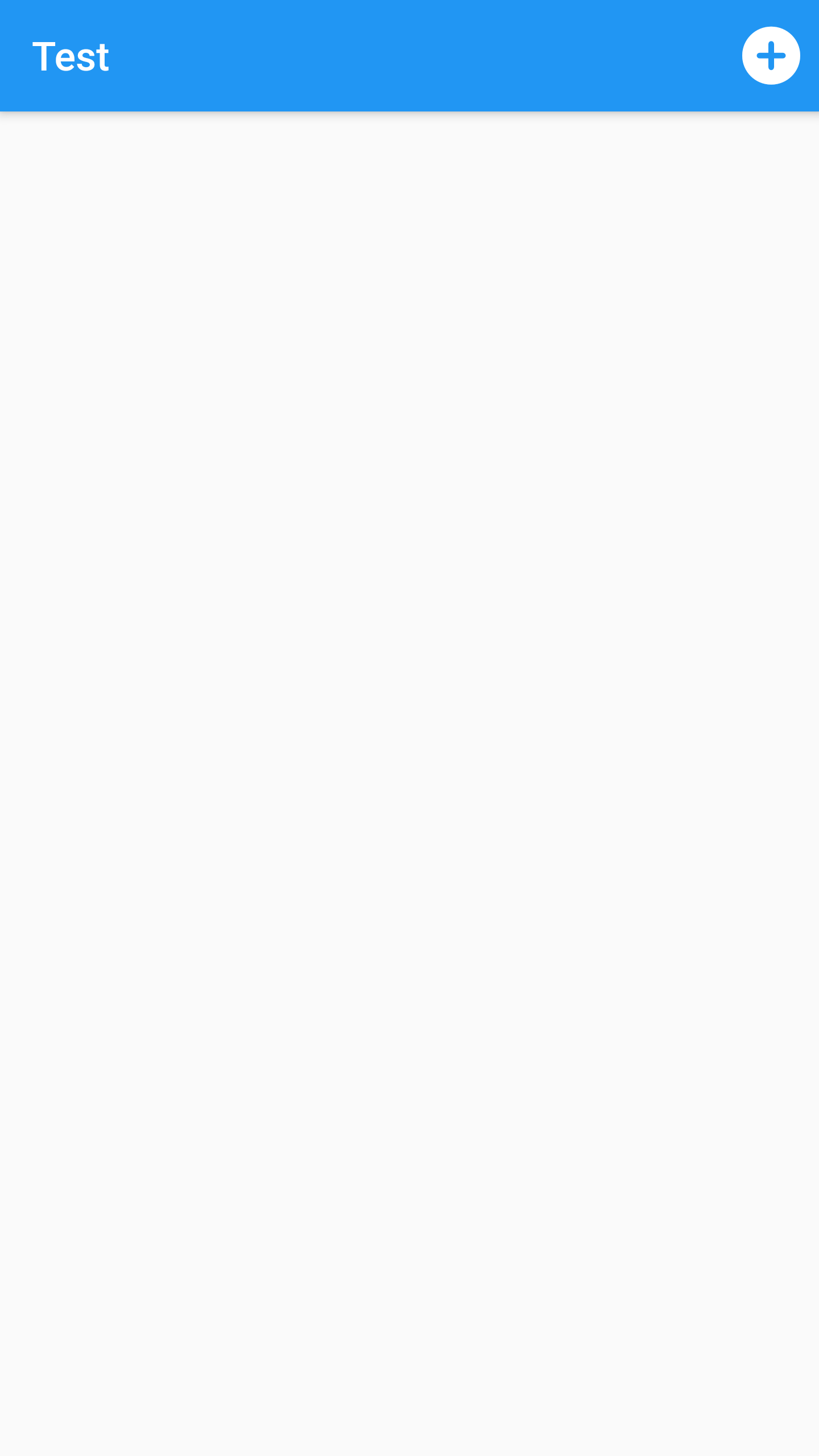
An icon button is a picture printed on a Material widget that reacts to touches by filling with
color (ink).
Icon buttons are commonly used in the AppBar.actions field, but they can be used in many other
places as
well.
Some properties of IconButton Class:
The icon to display inside the button.
The color to use for the icon inside the button, if the icon is enabled. Defaults to leaving this up to the icon widget.
The size of the icon inside the button.
The callback that is called when the button is tapped or otherwise activated.
The padding around the button's icon. The entire padded icon will react to input gestures.
Example :
appBar: AppBar(
title: const Text("Test"),
actions: [
IconButton(
icon: const Icon(Icons.add_circle_rounded),
color: Colors.white,
iconSize: 35,
onPressed: () {
//adding
},
padding: const EdgeInsets.all(2),
)
],
),
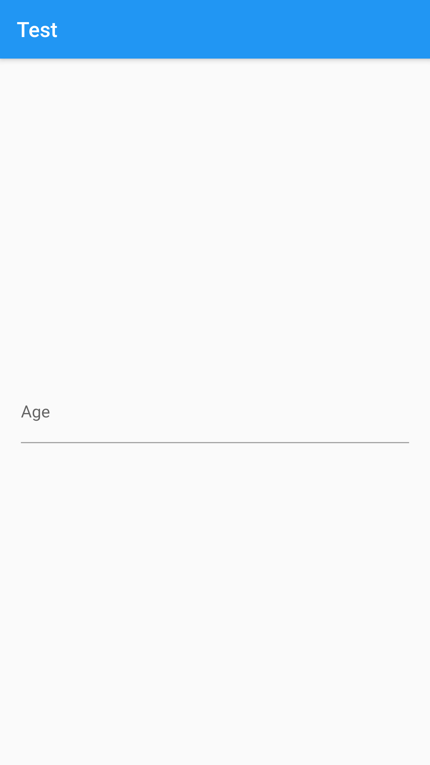
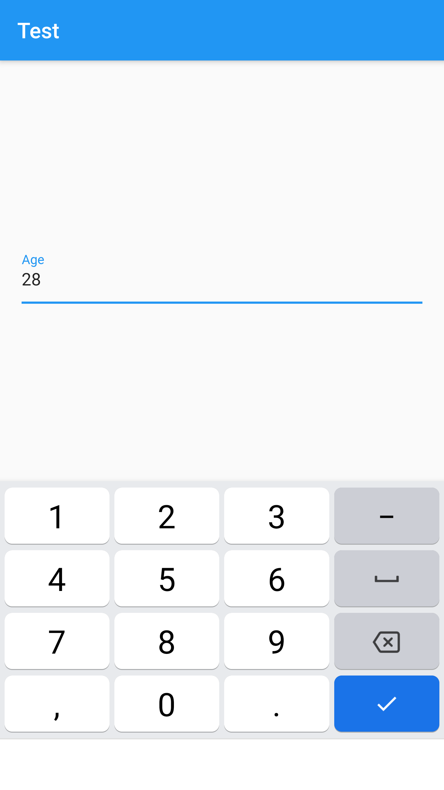
A text field lets the user enter text, either with hardware keyboard or with an onscreen
keyboard.
The text field calls the onChanged callback whenever the user changes the text in the field. If
the user
indicates that they are done typing in the field (e.g., by pressing a button on the soft
keyboard), the text
field calls the onSubmitted callback.
To control the text that is displayed in the text field, use the controller. For example, to set
the initial
value of the text field, use a controller that already contains some text. The controller can
also control
the selection and composing region (and to observe changes to the text, selection, and composing
region).
Remember to call TextEditingController.dispose of the TextEditingController when it is no longer
needed.
This will ensure we discard any resources used by the object.
Some properties of TextField Class:
Controls the text being edited.
The decoration to show around the text field.
Whether this widget's height will be sized to fill its parent.
The type of keyboard to use for editing the text.
Whether to hide the text being edited (e.g., for passwords).
Whether the text can be changed.
Example :
class _MyHomePageState extends State<MyHomePage> {
late TextEditingController _textEditingController;
@override
void initState() {
_textEditingController = TextEditingController();
super.initState();
}
@override
void dispose() {
_textEditingController.dispose();
super.dispose();
}
@override
Widget build(BuildContext context) {
return Scaffold(
appBar: AppBar(
title: const Text("Test"),
),
body: Container(
padding:const EdgeInsets.all(20),
alignment: Alignment.center,
child: TextField(
controller: _textEditingController,
decoration: const InputDecoration(labelText: "Age"),
keyboardType: TextInputType.number,
),
));
}
}
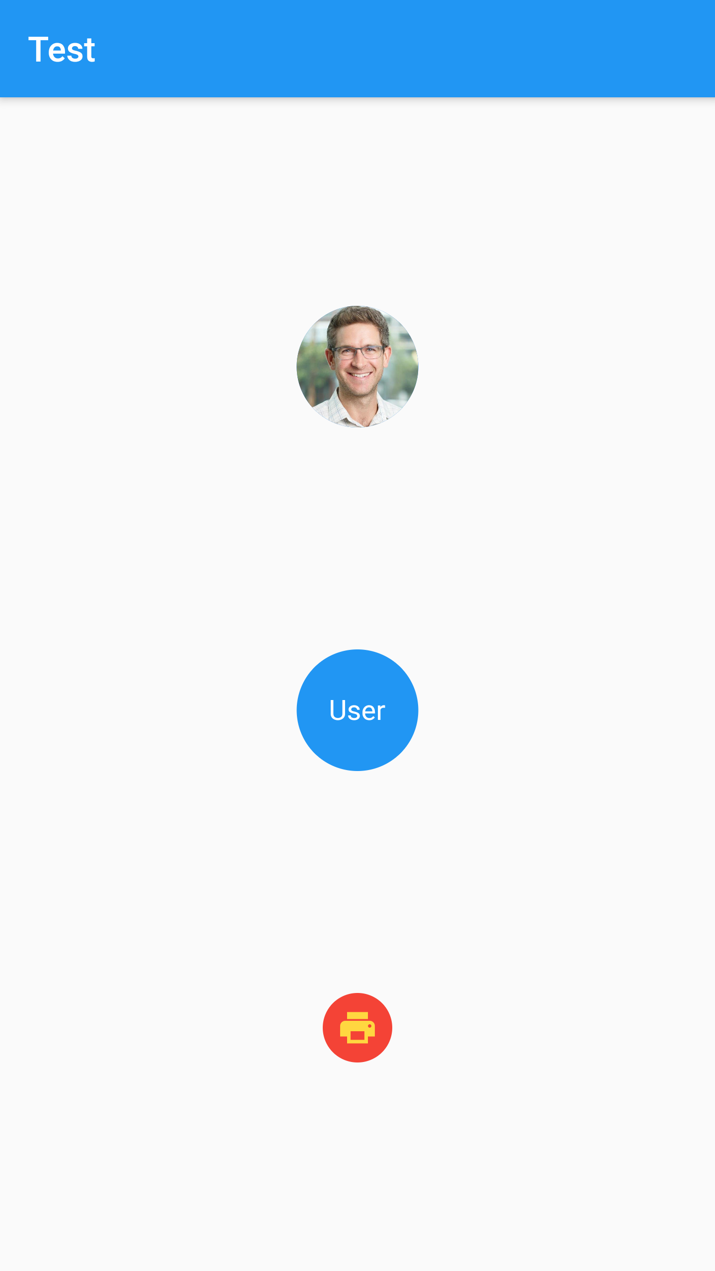
Typically used with a user's profile image, or, in the absence of such an image, the user's initials. A given user's initials should always be paired with the same background color, for consistency.
Some properties of CircleAvatar Class:
The widget below this widget in the tree.
The background image of the circle. Changing the background image will cause the avatar to animate to the new image.
The color with which to fill the circle. Changing the background color will cause the avatar to animate to the new color.
The default text color for text in the circle.
The size of the avatar, expressed as the radius (half the diameter).
Example :
Column(
mainAxisAlignment: MainAxisAlignment.spaceBetween,
children: const [
CircleAvatar(
backgroundImage: NetworkImage(
"https://www.hotfootdesign.co.uk/wp-content/uploads/2016/05/d5jA8OZv.jpg"),
radius: 35,
),
CircleAvatar(
child: Text("User"),
backgroundColor: Colors.blue,
foregroundColor: Colors.white,
radius: 35,
),
CircleAvatar(
child: Icon(Icons.print),
backgroundColor: Colors.red,
foregroundColor: Colors.amberAccent,
radius: 20,
)
],
)
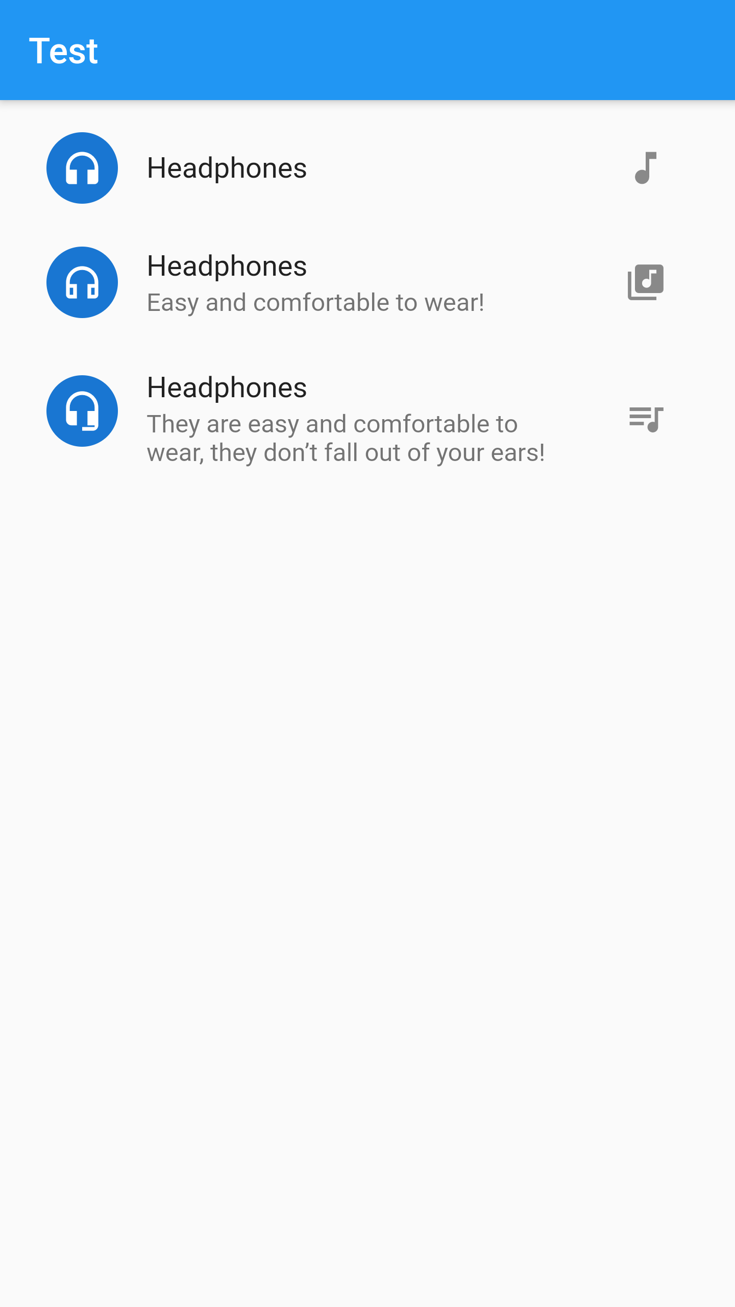
A single fixed-height row that typically contains some text as well as a leading or trailing
icon.
A list tile contains one to three lines of text optionally flanked by icons or other widgets,
such as check
boxes. The icons (or other widgets) for the tile are defined with the leading and trailing
parameters. The
first line of text is not optional and is specified with title. The value of subtitle, which is
optional,
will occupy the space allocated for an additional line of text, or two lines if isThreeLine is
true.
Some properties of ListTile Class:
A widget to display before the title.
The primary content of the list tile.
Additional content displayed below the title.
A widget to display after the title.
Whether this list tile is intended to display three lines of text.
Example :
Column(children: [
ListTile(
leading: const CircleAvatar(
child: Icon(Icons.headphones),
),
title: const Text("Headphones"),
trailing: IconButton(
icon: const Icon(Icons.music_note),
onPressed: () {},
),
),
ListTile(
leading: const CircleAvatar(
child: Icon(Icons.headphones_outlined),
),
title: const Text("Headphones"),
subtitle: const Text("Easy and comfortable to wear!"),
trailing: IconButton(
icon: const Icon(Icons.my_library_music),
onPressed: () {},
),
),
ListTile(
leading: const CircleAvatar(
child: Icon(Icons.headset_mic),
),
title: const Text("Headphones"),
subtitle: const Text(
"They are easy and comfortable to wear, they don’t fall out of your ears!"),
isThreeLine: true,
trailing: IconButton(
icon: const Icon(Icons.queue_music),
onPressed: () {},
),
),
])
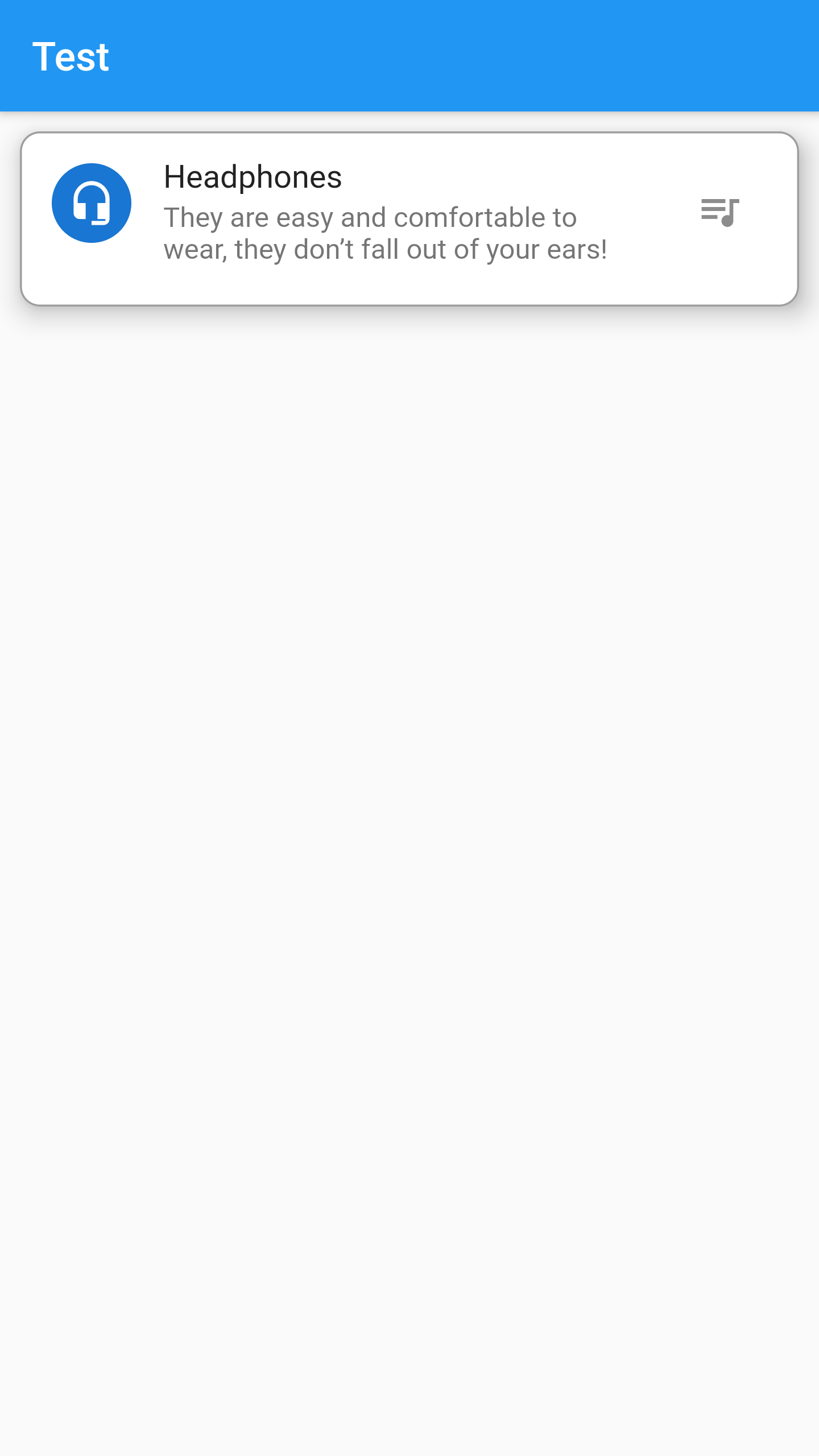
A material design card: a panel with slightly rounded corners and an elevation shadow.
Some properties of Card Class:
The widget below this widget in the tree.
The z-coordinate at which to place this card. This controls the size of the shadow below the card.
The color to paint the shadow below the card.
The shape of the card's Material.
The empty space that surrounds the card.
Example :
Card(
margin: EdgeInsets.all(10),
elevation: 10,
shape: RoundedRectangleBorder(
side: BorderSide(color: Colors.grey, width: 1),
borderRadius: BorderRadius.circular(10),
),
shadowColor: Colors.black,
child: ListTile(
leading: const CircleAvatar(
child: Icon(Icons.headset_mic),
),
title: const Text("Headphones"),
subtitle: const Text(
"They are easy and comfortable to wear, they don’t fall out of your ears!"),
isThreeLine: true,
trailing: IconButton(
icon: const Icon(Icons.queue_music),
onPressed: () {},
),
),
)
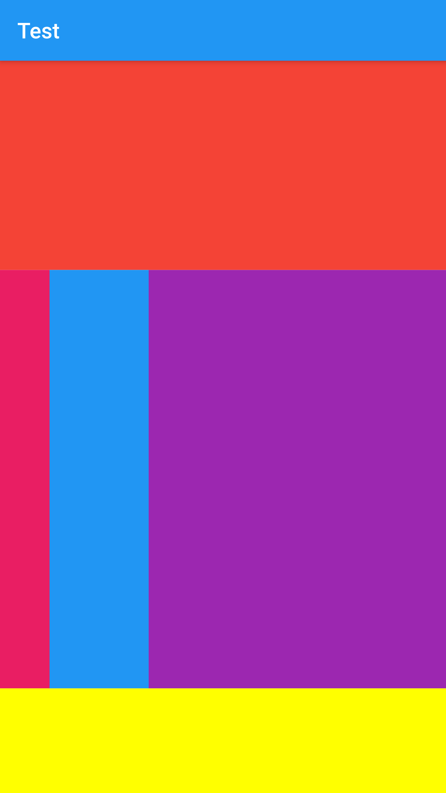
A widget that controls how a child of a Row, Column, or Flex flexes.
Using a Flexible widget gives a child of a Row, Column, or Flex the flexibility to expand to
fill the
available space in the main axis (e.g., horizontally for a Row or vertically for a Column), but,
unlike
Expanded, Flexible does not require the child to fill the available space.
A Flexible widget must be a descendant of a Row, Column, or Flex, and the path from the Flexible
widget to
its enclosing Row, Column, or Flex must contain only StatelessWidgets or StatefulWidgets.
Some properties of Flexible Class:
The widget below this widget in the tree.
How a flexible child is inscribed into the available space.
The flex factor to use for this child.
Example :
Column(
children: [
Flexible(
child: Container(
color: Colors.red,
),
flex: 2,
),
Flexible(
child: Row(
children: [
Flexible(
child: Container(
color: Colors.pink,
),
flex: 1,
),
Flexible(
child: Container(
color: Colors.blue,
),
flex: 2,
),
Flexible(
child: Container(
color: Colors.purple,
),
flex: 6,
)
],
),
flex: 4,
),
Flexible(
child: Container(
color: Colors.yellowAccent,
),
flex: 1,
),
],
)
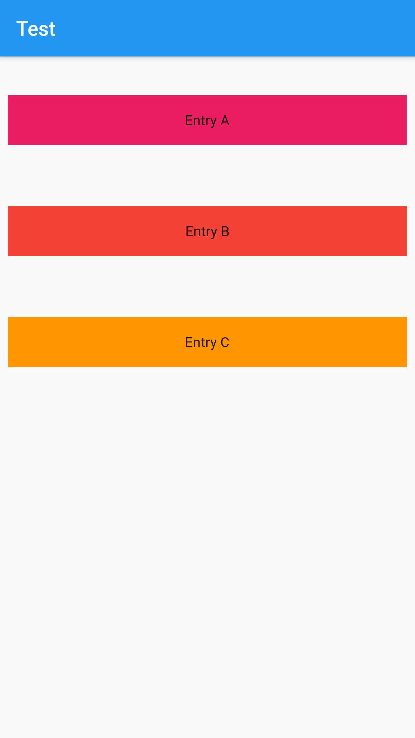
A scrollable list of widgets arranged linearly.
ListView is the most commonly used scrolling widget. It displays its children one after another
in the
scroll direction. In the cross axis, the children are required to fill the ListView.
There are four options for constructing a ListView:
Example 1:
ListView(
padding: const EdgeInsets.all(8),
children: <Widget>[
Container(
height: 50,
margin: const EdgeInsets.symmetric(vertical: 30),
color: Colors.pink,
child: const Center(child: Text('Entry A')),
),
Container(
height: 50,
margin: const EdgeInsets.symmetric(vertical: 30),
color: Colors.red,
child: const Center(child: Text('Entry B')),
),
Container(
height: 50,
margin: const EdgeInsets.symmetric(vertical: 30),
color: Colors.orange,
child: const Center(child: Text('Entry C')),
),
],
)
Example 2:
class _MyHomePageState extends State<MyHomePage> {
final List<String> entries = <String>['A', 'B', 'C'];
final List<Color> colors = <Color>[Colors.pink,Colors.red, Colors.orange];
@override
Widget build(BuildContext context) {
return Scaffold(
appBar: AppBar(
title: const Text("Test"),
),
body: ListView.builder(
padding: const EdgeInsets.all(8),
itemCount: entries.length,
itemBuilder: (BuildContext context, int index) {
return Container(
height: 50,
margin: const EdgeInsets.symmetric(vertical: 30),
color: colors[index],
child: Center(child: Text('Entry ${entries[index]}')),
);
}));
}
}

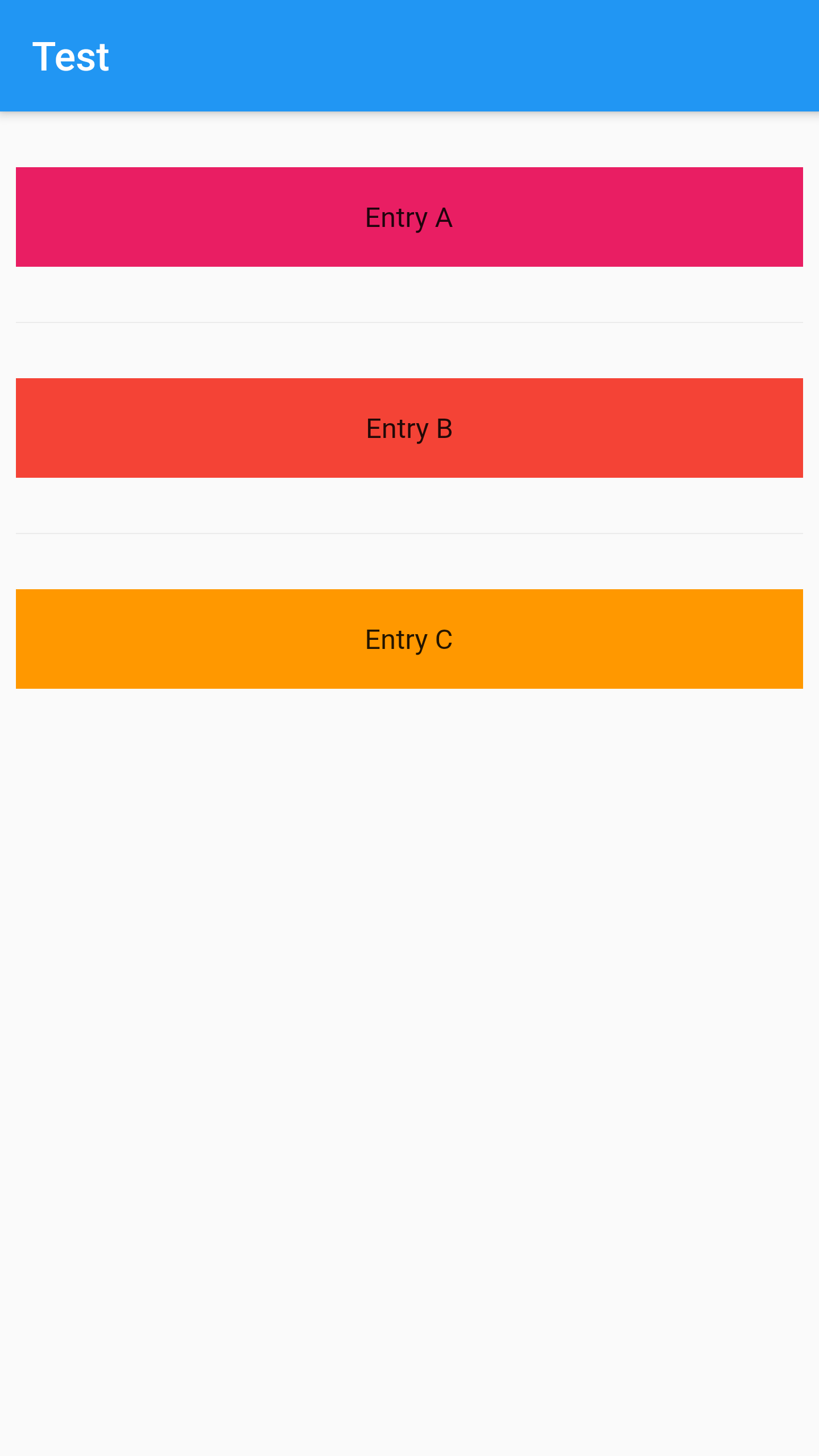
Example 3:
class _MyHomePageState extends State<MyHomePage> {
final List<String> entries = <String>['A', 'B', 'C'];
final List<Color> colors = <Color>[Colors.pink, Colors.red, Colors.orange];
@override
Widget build(BuildContext context) {
return Scaffold(
appBar: AppBar(
title: const Text("Test"),
),
body: ListView.separated(
padding: const EdgeInsets.all(8),
itemCount: entries.length,
itemBuilder: (BuildContext context, int index) {
return Container(
height: 50,
color: colors[index],
margin: const EdgeInsets.symmetric(vertical: 20),
child: Center(child: Text('Entry ${entries[index]}')),
);
},
separatorBuilder: (BuildContext context, int index) =>
const Divider(),
));
}
}
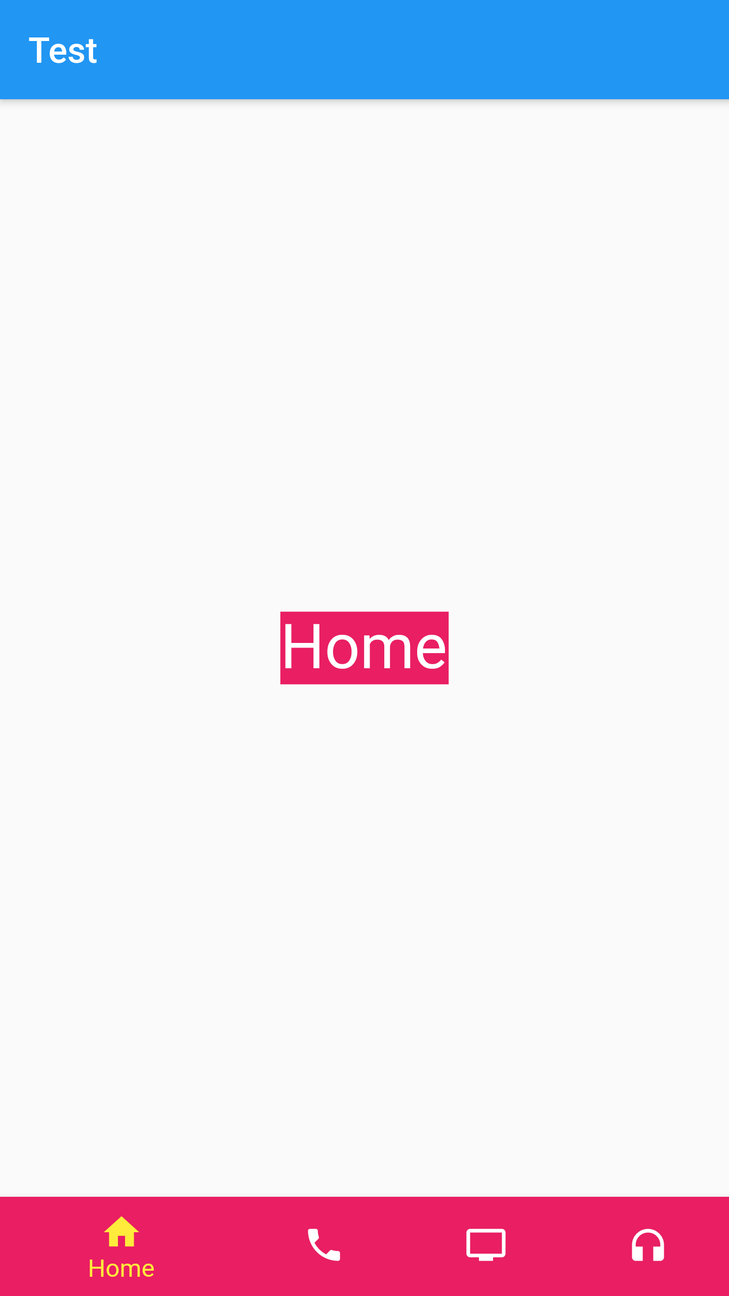
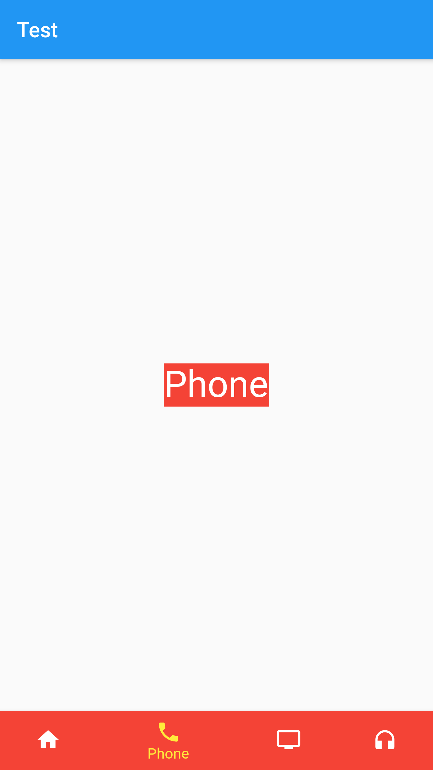
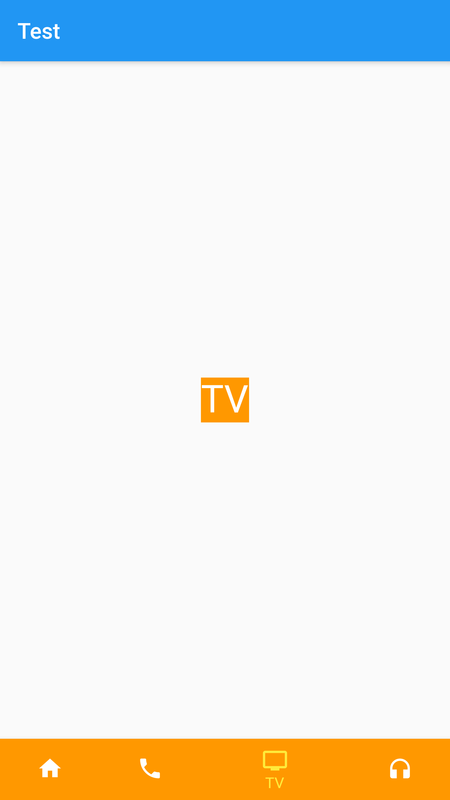
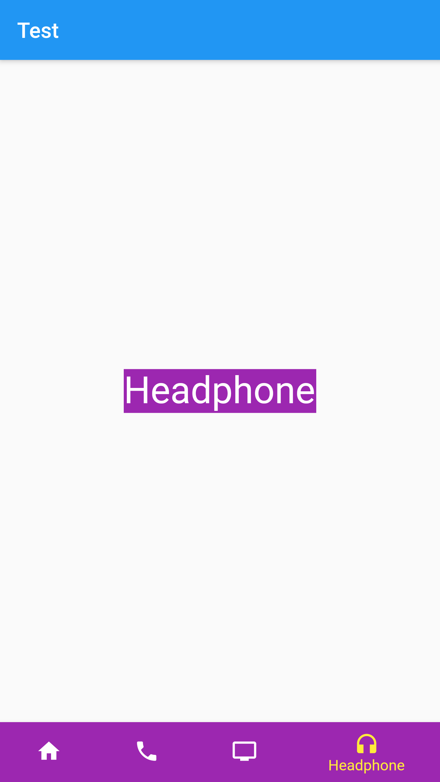
A material widget that's displayed at the bottom of an app for selecting among a small number of
views,
typically between three and five.
The bottom navigation bar consists of multiple items in the form of text labels, icons, or both,
laid out on
top of a piece of material. It provides quick navigation between the top-level views of an app.
For larger
screens, side navigation may be a better fit.
A bottom navigation bar is usually used in conjunction with a Scaffold, where it is provided as
the
Scaffold.bottomNavigationBar argument.
Some properties of BottomNavigationBar Class:
Defines the appearance of the button items that are arrayed within the bottom navigation bar.
The index into items for the current active BottomNavigationBarItem.
The color of the selected BottomNavigationBarItem.icon.
Called when one of the items is tapped.
The TextStyle of the BottomNavigationBarItem labels when they are selected.
Example :
class _MyHomePageState extends State<MyHomePage> {
final List<String> texts = <String>['Home', 'Phone', 'TV', 'Headphone'];
final List<Color> colors = <Color>[
Colors.pink,
Colors.red,
Colors.orange,
Colors.purple
];
int _index = 0;
@override
Widget build(BuildContext context) {
return Scaffold(
appBar: AppBar(
title: const Text("Test"),
),
body: Center(
child: Container(
color: colors[_index],
child: Text(
texts[_index],
style: const TextStyle(color: Colors.white, fontSize: 35),
),
),
),
bottomNavigationBar: BottomNavigationBar(
items: [
BottomNavigationBarItem(
icon: const Icon(Icons.home),
label: texts[0],
backgroundColor: colors[0]),
BottomNavigationBarItem(
icon: const Icon(Icons.phone),
label: texts[1],
backgroundColor: colors[1]),
BottomNavigationBarItem(
icon: const Icon(Icons.tv),
label: texts[2],
backgroundColor: colors[2]),
BottomNavigationBarItem(
icon: const Icon(Icons.headphones),
label: texts[3],
backgroundColor: colors[3]),
],
currentIndex: _index,
selectedItemColor: Colors.yellow,
onTap: (int idx) {
setState(() {
_index = idx;
});
},
),
);
}
}
