Analyzing First App
The lib folder is where we will write the application code.
The default app have only main.dart file in the lib folder.
It contains 63 lines after deleting the comments (green lines starting with the double slashes) and able to render this application onto the screen.
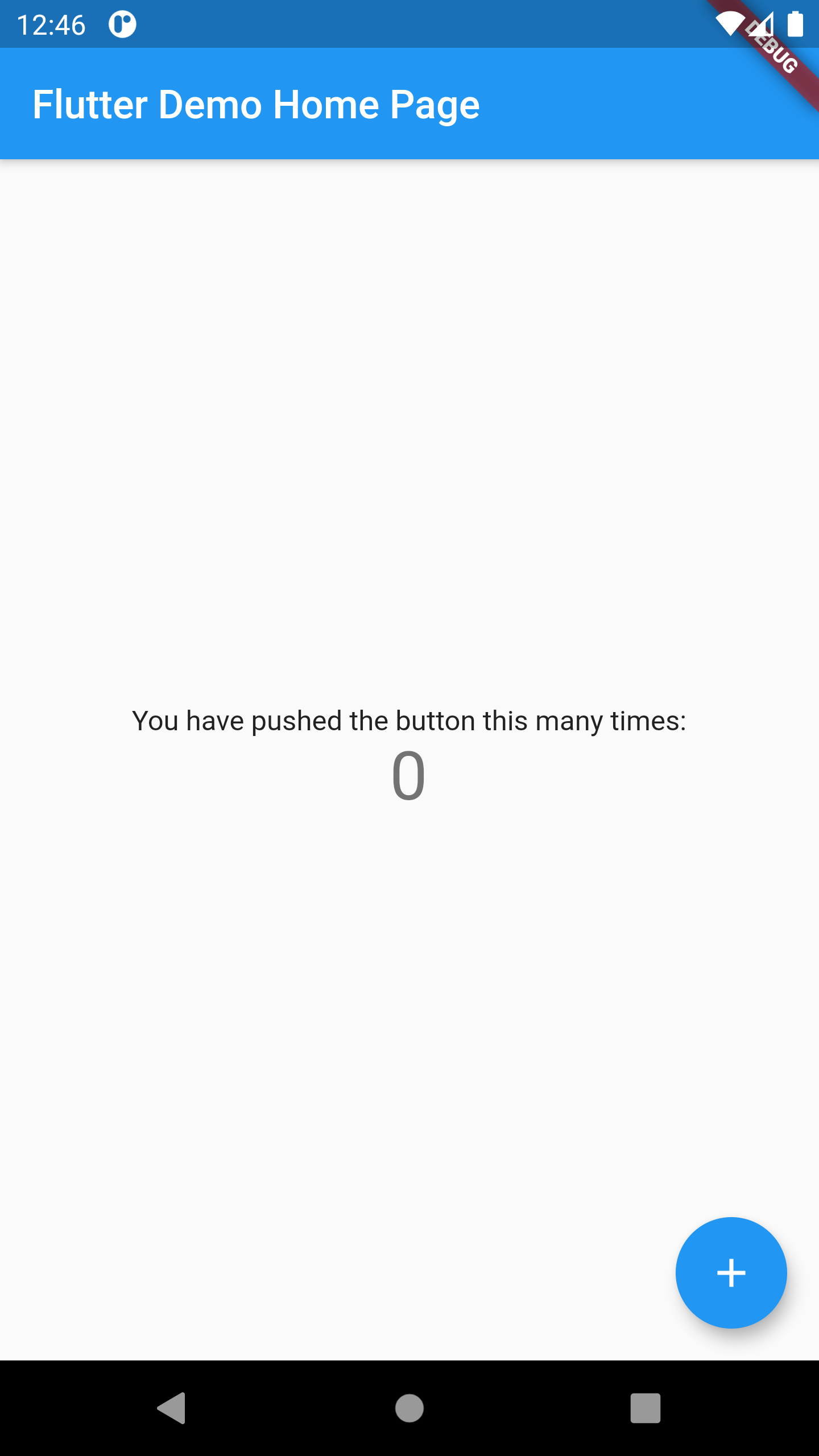
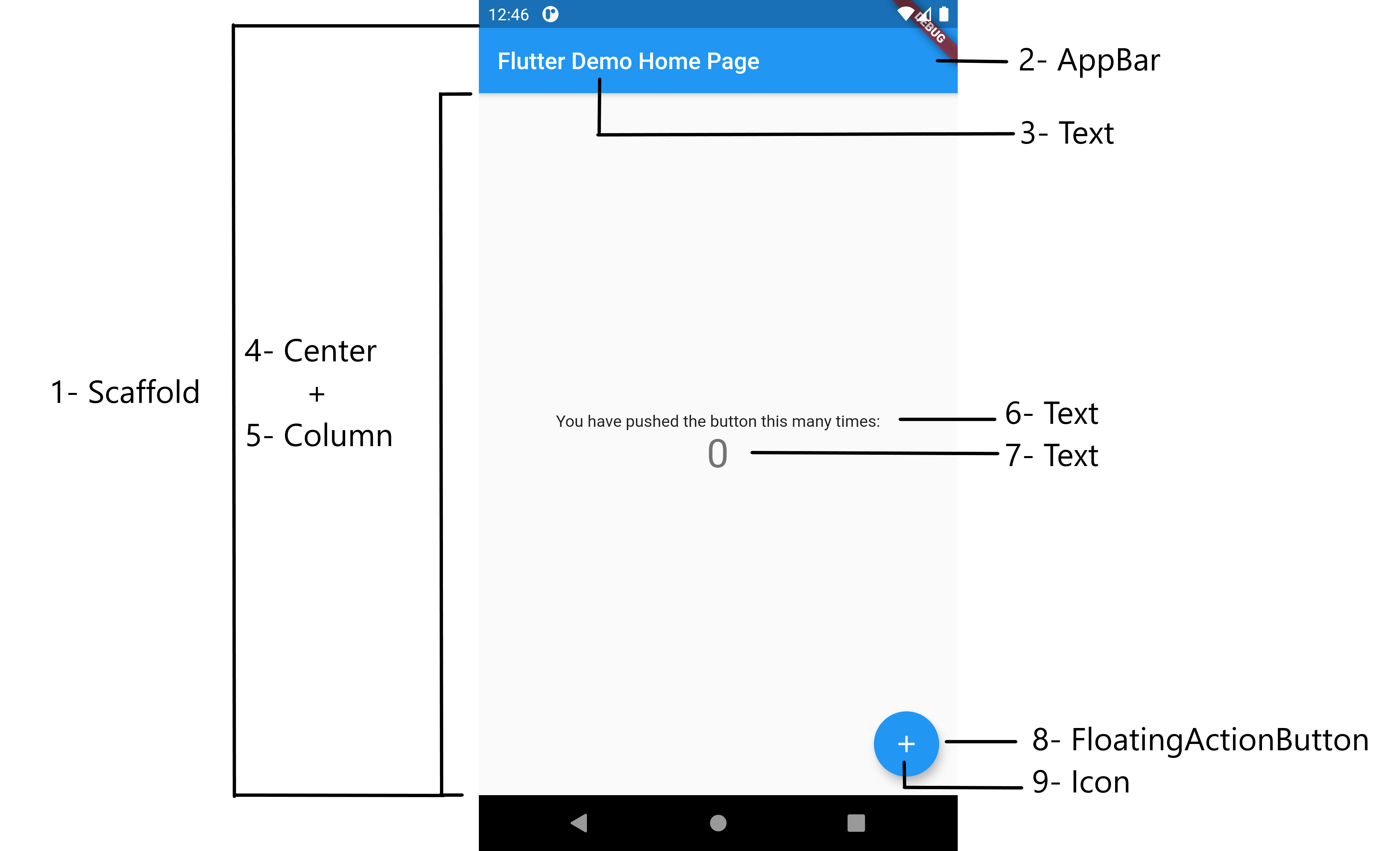
For the moment, we will not understand all the code but as we mentioned in the introduction that Flutter uses widgets to build the UI, so we will try to identify some widgets.

import 'package:flutter/material.dart';
void main() => runApp(MyApp());
class MyApp extends StatelessWidget {
@override
Widget build(BuildContext context) {
return MaterialApp(
title: 'Flutter Demo',
theme: ThemeData(
primarySwatch: Colors.blue,
visualDensity: VisualDensity.adaptivePlatformDensity,
),
home: MyHomePage(title: 'Flutter Demo Home Page'),
);
}
}
class MyHomePage extends StatefulWidget {
MyHomePage({Key key, this.title}) : super(key: key);
final String title;
@override
_MyHomePageState createState() => _MyHomePageState();
}
class _MyHomePageState extends State<MyHomePage> {
int _counter = 0;
void _incrementCounter() {
setState(() {
_counter++;
});
}
@override
Widget build(BuildContext context) {
return Scaffold(
appBar: AppBar(
title: Text(widget.title),
),
body: Center(
child: Column(
mainAxisAlignment: MainAxisAlignment.center,
children: <Widget>[
Text(
'You have pushed the button this many times:',
),
Text(
'$_counter',
style: Theme.of(context).textTheme.headline4,
),
],
),
),
floatingActionButton: FloatingActionButton(
onPressed: _incrementCounter,
tooltip: 'Increment',
child: Icon(Icons.add),
),
);
}
}

1- Scaffold :
Implements the basic material design visual layout structure.
......
);
2- AppBar :
App bars are typically used in the Scaffold.appBar property, which places the app bar as a fixed-height widget at the top of the screen. It displays the toolbar widgets, leading, title, and actions, above the bottom (if any).
title: Text(widget.title),
),
3,6,7- Text :
The Text widget displays a string of text with single style.
........
Text(
'You have pushed the button this many times:',
),
Text(
'$_counter',
style: Theme.of(context).textTheme.headline4,
),
4- Center
A widget that centers its child within itself.
Center(
.......
);
5- Column
A widget that displays its children in a vertical array.
Column(
mainAxisAlignment: MainAxisAlignment.center,
children: <Widget>[
..............],
)
8- FloatingActionButton
A floating action button is a circular icon button that hovers over content to promote a primary action in the application. Floating action buttons are most commonly used in the Scaffold.floatingActionButton field.
onPressed: _incrementCounter,
tooltip: 'Increment',
child: Icon(Icons.add)
),
9- Icon
A graphical icon widget drawn with a glyph from a font described in an IconData such as material's predefined IconDatas in Icons.