App4 : Flags Quiz - Learning New Widgets
Table Of Content :
- ClipRRect
- child : Widget
- borderRadius : BorderRadius
- GestureDetector
- child : Widget
- onTap : GestureTapCallback
- onLongPress : GestureLongPressCallback
- onDoubleTap : GestureLongPressCallback
- Divider
- color : Color
- height : double
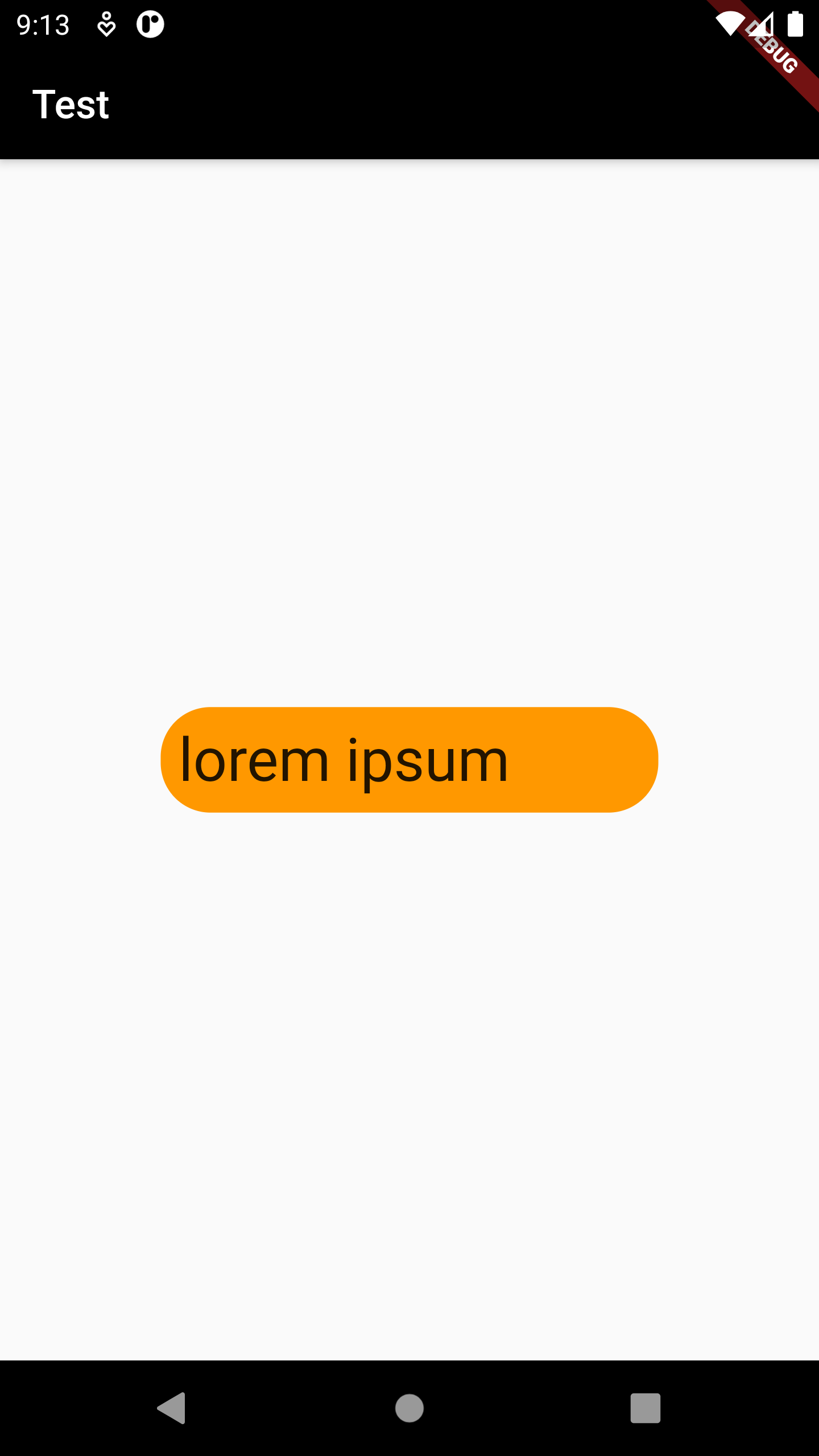
A widget that clips its child using a rounded rectangle.
Some properties of ClipRRect Class:
The widget below this widget in the tree.
The border radius of the rounded corners.
Example :
ClipRRect(
borderRadius: BorderRadius.circular(25),
child: Container(
color: Colors.orange,
width: 250,
padding: EdgeInsets.all(9),
child: Text(
"lorem ipsum",
style: TextStyle(fontSize: 30),
),
),
)

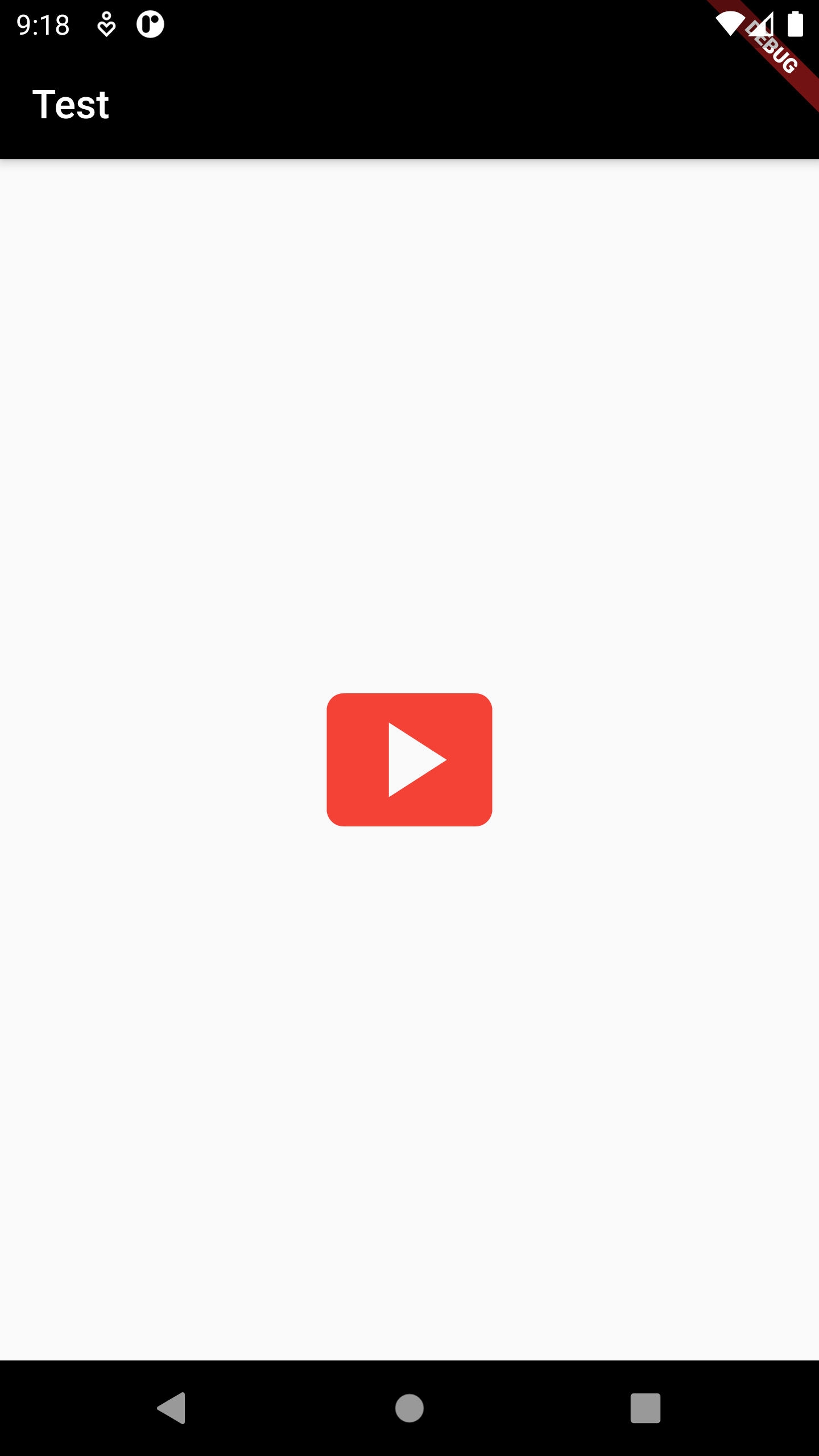
A widget that detects gestures. Attempts to recognize gestures that correspond to its non-null callbacks.
Some properties of GestureDetector Class:
The widget below this widget in the tree.
A tap with a primary button has occurred.
Called when a long press gesture with a primary button has been recognized.
The user has tapped the screen with a primary button at the same location twice in quick succession
Example
GestureDetector(
child: Icon(
Icons.smart_display,
size: 100,
color: Colors.red,
),
onTap: () {
print("Tap");
},
onDoubleTap: () {
print("Dobule Tap");
},
onLongPress: () {
print("Long Press");
},
)

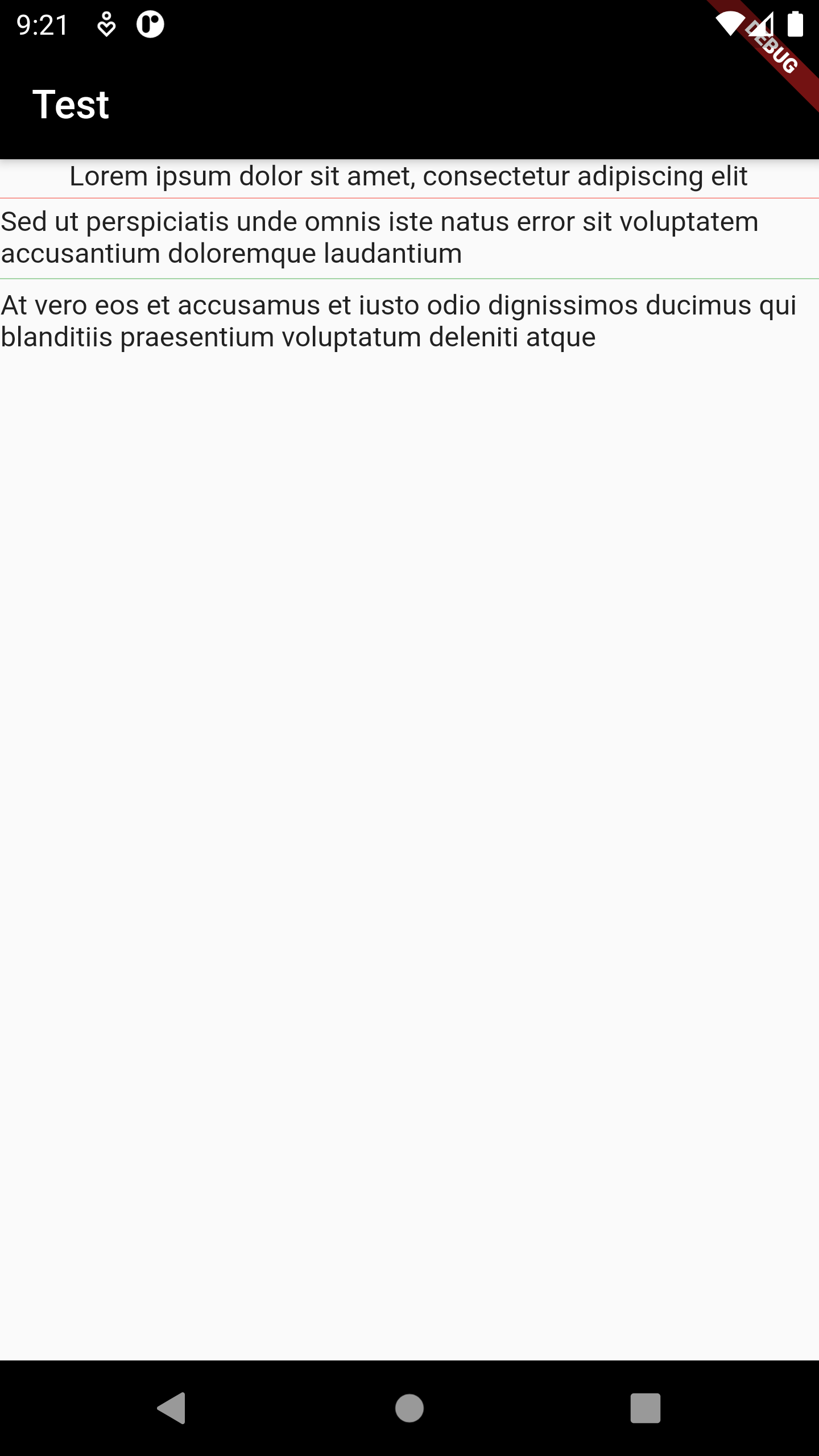
A thin horizontal line, with padding on either side.
Some properties of Divider Class:
The color to use when painting the line.
The divider's height extent.
Example
Column(
children: [
Text("Lorem ipsum dolor sit amet, consectetur adipiscing elit"),
Divider(
height: 7,
color: Colors.red,
),
Text(
"Sed ut perspiciatis unde omnis iste natus error sit voluptatem accusantium doloremque laudantium"),
Divider(
height: 10,
color: Colors.green,
),
Text(
"At vero eos et accusamus et iusto odio dignissimos ducimus qui blanditiis praesentium voluptatum deleniti atque")
],
)
