Using the LayoutBuilder class
Builds a widget tree that can depend on the parent widget's size.
From its builder property, you get a BoxConstraints object. Examine the constraint’s properties to decide what to display. For example, if your maxWidth is greater than your width breakpoint, return a spanword Scaffold object with a row that has a list on the left. If it’s narrower, return a Scaffold object with a drawer containing that list. You can also adjust your display based on the device’s height, the aspect ratio, or some other property. When the constraints change (for example, the user rotates the phone, or puts your app into a tile UI in Nougat), the build function runs.
The builder function is called in the following situations:
-
The first time the widget is laid out.
-
When the parent widget passes different layout constraints.
-
When the parent widget updates this widget.
-
When the dependencies that the builder function subscribes to change.
The builder function is not called during layout if the parent passes the same constraints repeatedly.
Example :
class MyStatelessWidget extends StatelessWidget {
const MyStatelessWidget({Key? key}) : super(key: key);
@override
Widget build(BuildContext context) {
return Scaffold(
appBar: AppBar(title: const Text('LayoutBuilder Example')),
body: LayoutBuilder(
builder: (BuildContext context, BoxConstraints constraints) {
if (constraints.maxWidth > 600) {
return _buildWideContainers();
} else {
return _buildNormalContainer();
}
},
),
);
}
Widget _buildNormalContainer() {
return Center(
child: Container(
height: 100.0,
width: 100.0,
color: Colors.red,
),
);
}
Widget _buildWideContainers() {
return Center(
child: Row(
mainAxisAlignment: MainAxisAlignment.spaceEvenly,
children: <Widget>[
Container(
height: 100.0,
width: 100.0,
color: Colors.red,
),
Container(
height: 100.0,
width: 100.0,
color: Colors.yellow,
),
],
),
);
}
}
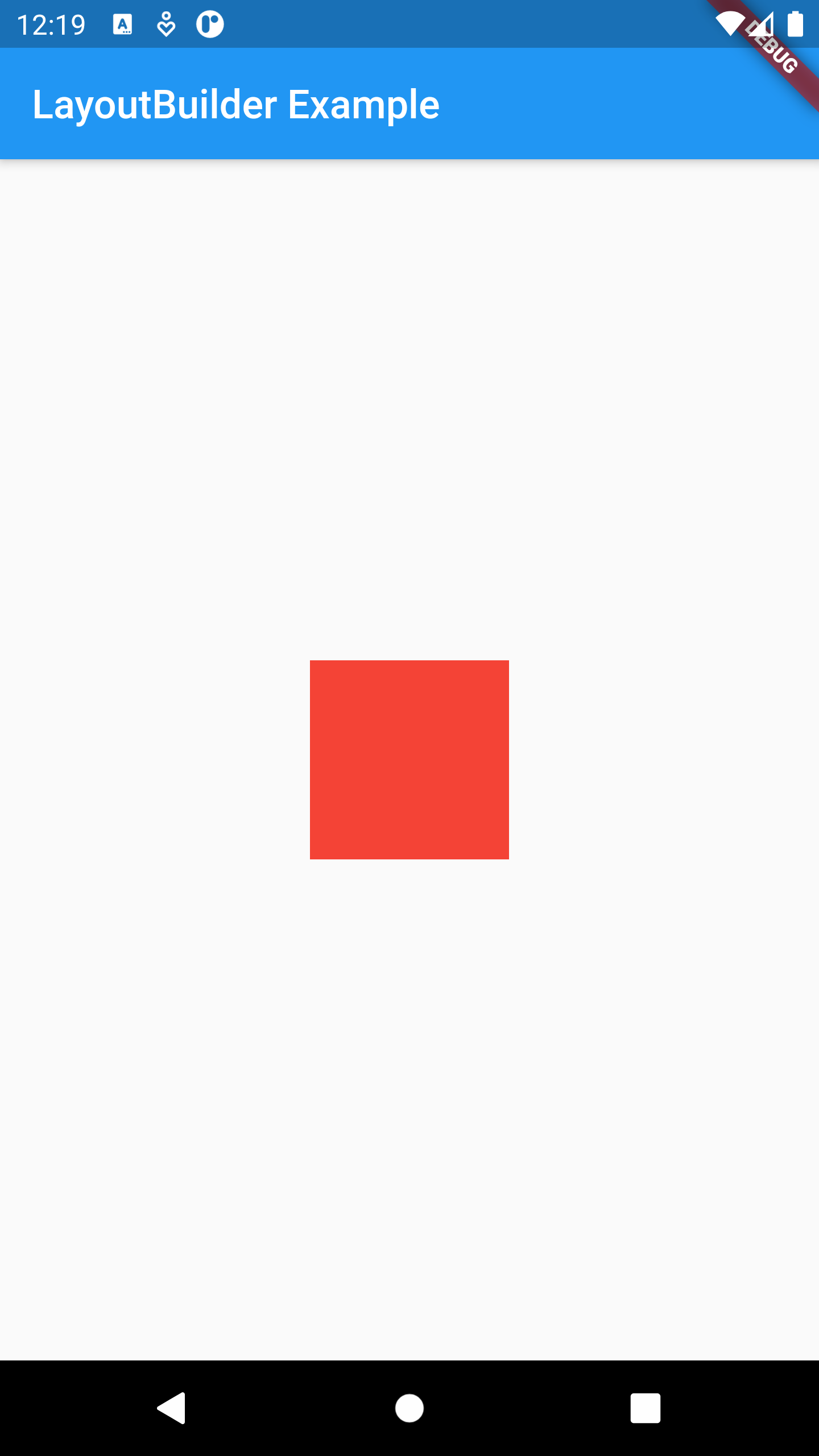
On Portrait Mode : width = 400 < 600

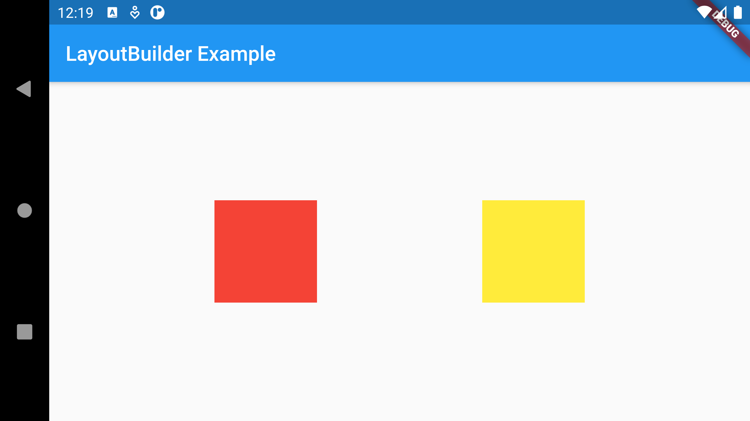
On Landscape Mode : width = 683 > 600

Exercise :
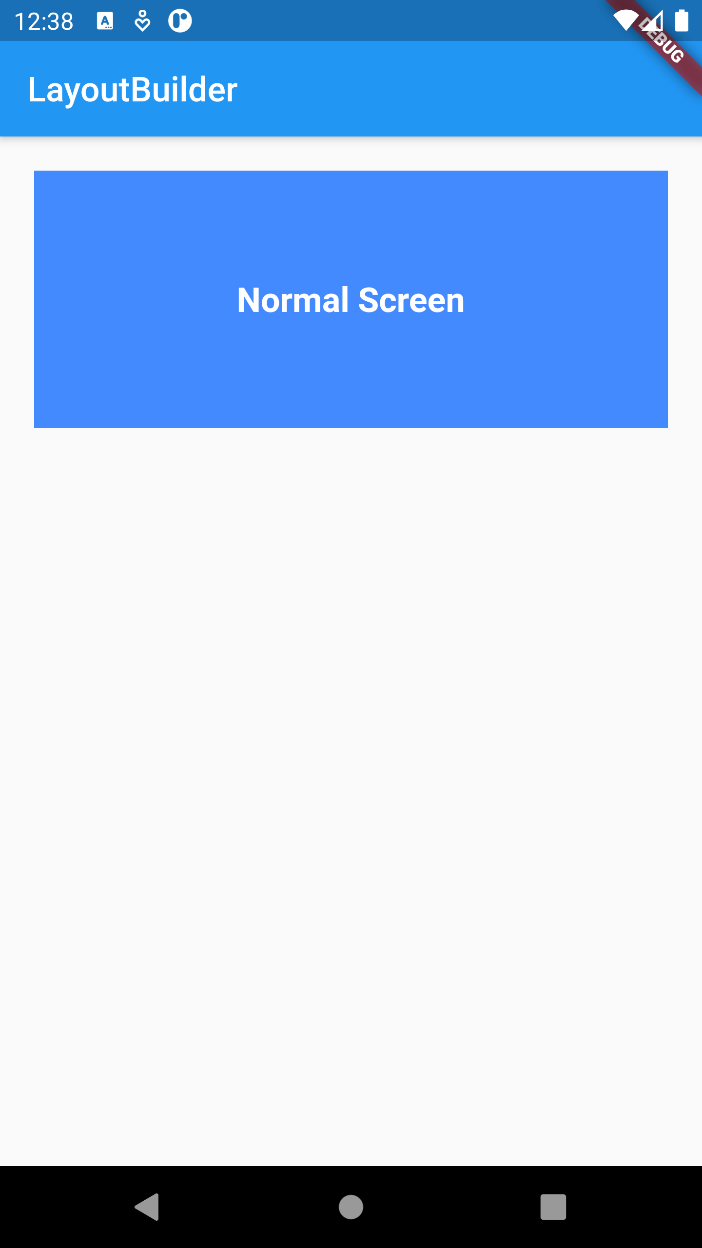
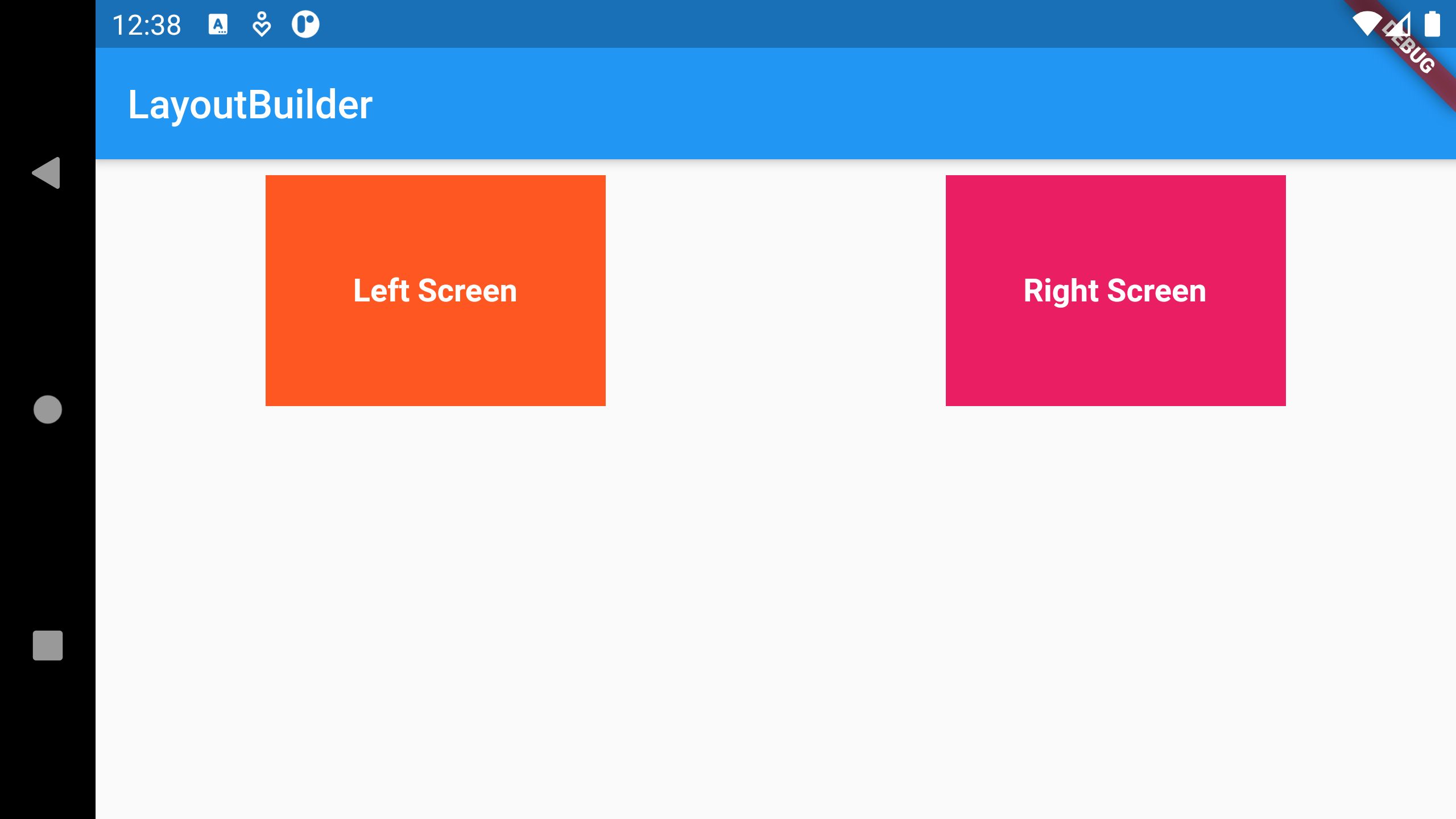
Try to do this using LayoutBuilder.


Solution :
LayoutBuilder(
builder: (BuildContext ctx, BoxConstraints constraints) {
// if the screen width >= 450
if (constraints.maxWidth >= 450) {
return Row(
mainAxisAlignment: MainAxisAlignment.spaceAround,
children: <Widget>[
Container(
padding: const EdgeInsets.all(8),
alignment: Alignment.center,
height: constraints.maxHeight * 0.35,
width: constraints.maxWidth * 0.25,
margin: const EdgeInsets.all(8),
color: Colors.deepOrange,
child: const Text(
'Left Screen',
style: TextStyle(
fontSize: 16,
fontWeight: FontWeight.bold,
color: Colors.white,
),
),
),
Container(
padding: const EdgeInsets.all(8),
alignment: Alignment.center,
height: constraints.maxHeight * 0.35,
width: constraints.maxWidth * 0.25,
margin: const EdgeInsets.all(8),
color: Colors.pink,
child: const Text(
'Right Screen',
style: TextStyle(
fontSize: 16,
fontWeight: FontWeight.bold,
color: Colors.white,
),
),
),
],
);
// If screen size is < 450
} else {
return Container(
alignment: Alignment.center,
margin: const EdgeInsets.all(20),
height: constraints.maxHeight * 0.25,
color: Colors.blueAccent,
child: const Text(
'Normal Screen',
style: TextStyle(
fontSize: 20,
fontWeight: FontWeight.bold,
color: Colors.white,
),
),
);
}
},
)