App6 v2 : My Books - Learning New Widgets
Table Of Content :
- CupertinoButton
- borderRadius : BorderRadius?
- child : Widget
- color : Color?
- onPressed :
- padding : EdgeInsetsGeometry?
- CupertinoPicker
- children : List<Widget>
- backgroundColor : Color?
- itemExtent : double
- magnification : double
- onSelectedItemChanged :
- selectionOverlay : Widget?
- CupertinoTabBar
- activeColor : Color?
- backgroundColor : Color?
- currentIndex : int
- iconSize : double
- inactiveColor : Color
- items : List<BottomNavigationBarItem>
- onTap :
- CupertinoTextField
- controller : TextEditingController?
- decoration : BoxDecoration?
- keyboardType : TextInputType
- placeholder : String?
- style : TextStyle?
- textAlign : TextAlign
- CupertinoNavigationBar
- backgroundColor : Color?
- leading : Widget?
- middle : Widget?
- trailing : Widget?
An iOS-style button.
Takes in a text or an icon that fades out and in on touch. May optionally have a background.
The padding defaults to 16.0 pixels. When using a CupertinoButton within a fixed height parent, like a
CupertinoNavigationBar, a smaller, or even EdgeInsets.zero, should be used to prevent clipping larger child
widgets.
Some properties of CupertinoButton Class:
The radius of the button's corners when it has a background color.
The widget below this widget in the tree.
The color of the button's background.
The callback that is called when the button is tapped or otherwise activated.
The amount of space to surround the child inside the bounds of the button.
Example :
Scaffold(
body: Center(
child: CupertinoButton(
child: const Text("Click Me !"),
onPressed: () {
print("Clicked=");
},
borderRadius: BorderRadius.circular(20),
color: Colors.lightBlue,
padding: const EdgeInsets.all(8),
),
),
)

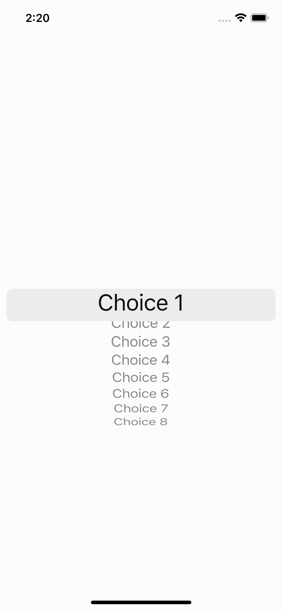
An iOS-styled picker.
Displays its children widgets on a wheel for selection and calls back when the currently selected item
changes.
By default, the first child in children will be the initially selected child. The index of a different child
can be specified in scrollController, to make that child the initially selected child.
Can be used with showCupertinoModalPopup to display the picker modally at the bottom of the screen. When
calling showCupertinoModalPopup, be sure to set semanticsDismissible to true to enable dismissing the modal
via semantics.
Sizes itself to its parent. All children are sized to the same size based on itemExtent.
By default, descendent texts are shown with CupertinoTextThemeData.pickerTextStyle.
Some properties of CupertinoPicker Class:
The widgets.
Background color behind the children.
The uniform height of all children.
The zoomed-in rate of the magnifier, if it is used.
An option callback when the currently centered item changes.
A widget overlaid on the picker to highlight the currently selected entry.
Example :
CupertinoPicker(
children: const [
Text("Choice 1"),
Text("Choice 2"),
Text("Choice 3"),
Text("Choice 4"),
Text("Choice 5"),
Text("Choice 6"),
Text("Choice 7"),
Text("Choice 8")
],
backgroundColor: Colors.white38,
itemExtent: 30,
magnification: 1.5,
onSelectedItemChanged: (int val) {
selected = val;
},
),

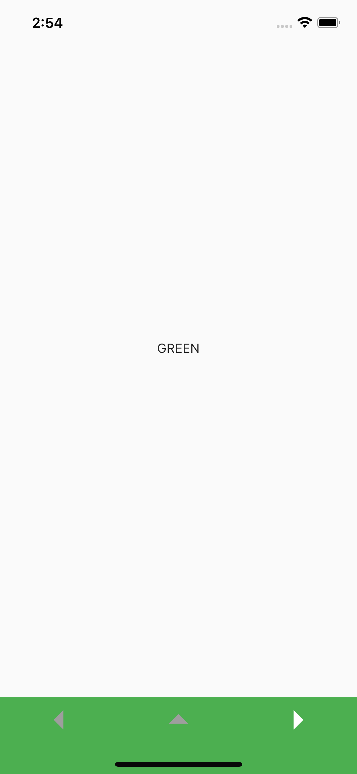
An iOS-styled bottom navigation tab bar.
Displays multiple tabs using BottomNavigationBarItem with one tab being active, the first tab by default.
This StatelessWidget doesn't store the active tab itself. You must listen to the onTap callbacks and call
setState with a new currentIndex for the new selection to reflect. This can also be done automatically by
wrapping this with a CupertinoTabScaffold.
Tab changes typically trigger a switch between Navigators, each with its own navigation stack, per standard
iOS design. This can be done by using CupertinoTabViews inside each tab builder in CupertinoTabScaffold.
If the given backgroundColor's opacity is not 1.0 (which is the case by default), it will produce a blurring
effect to the content behind it.
Some properties of CupertinoTabBar Class:
The foreground color of the icon and title for the BottomNavigationBarItem of the selected tab.
The background color of the tab bar. If it contains transparency, the tab bar will automatically produce a blurring effect to the content behind it.
The index into items of the current active item.
The size of all of the BottomNavigationBarItem icons.
The foreground color of the icon and title for the BottomNavigationBarItems in the unselected state.
The interactive items laid out within the bottom navigation bar.
The callback that is called when a item is tapped.
Example :
int selected = 0;
final texts = ['RED', 'BLUE', 'GREEN'];
final colors = [Colors.red, Colors.blue, Colors.green];
@override
Widget build(BuildContext context) {
return Scaffold(
body: Center(
child: Text(texts[selected]),
),
bottomNavigationBar: CupertinoTabBar(
currentIndex: selected,
iconSize: 50,
activeColor: Colors.white,
inactiveColor: Colors.grey,
backgroundColor: colors[selected],
onTap: (int val) {
setState(() {
selected = val;
});
},
items: const [
BottomNavigationBarItem(icon: Icon(Icons.arrow_left)),
BottomNavigationBarItem(icon: Icon(Icons.arrow_drop_up)),
BottomNavigationBarItem(icon: Icon(Icons.arrow_right))
],
),
);
}

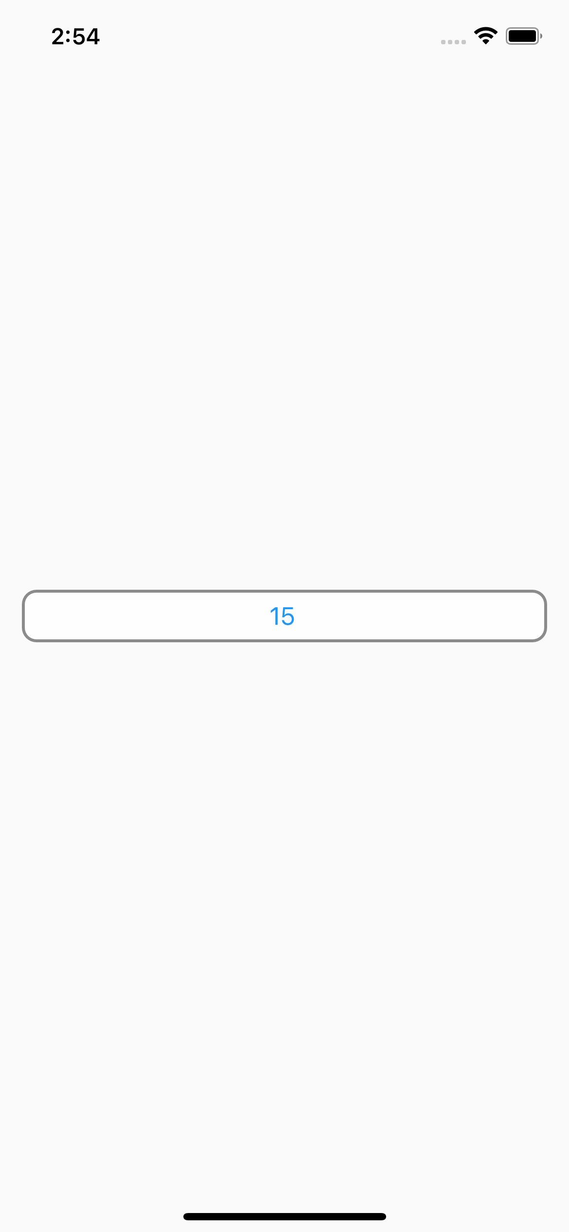
An iOS-style text field.
A text field lets the user enter text, either with a hardware keyboard or with an onscreen keyboard.
This widget corresponds to both a UITextField and an editable UITextView on iOS.
The text field calls the onChanged callback whenever the user changes the text in the field. If the user
indicates that they are done typing in the field (e.g., by pressing a button on the soft keyboard), the text
field calls the onSubmitted callback.
It's important to always use characters when dealing with user input text that may contain complex
characters. This will ensure that extended grapheme clusters and surrogate pairs are treated as single
characters, as they appear to the user.
Some properties of CupertinoTextField Class:
Controls the text being edited.
Controls the BoxDecoration of the box behind the text input.
The type of keyboard to use for editing the text.
A lighter colored placeholder hint that appears on the first line of the text field when the text entry is empty.
The style to use for the text being edited.
How the text should be aligned horizontally.
Example :
CupertinoTextField(
controller: tec,
decoration: BoxDecoration(
color: Colors.white70,
border: Border.all(width: 2,color: Colors.black45),
borderRadius: BorderRadius.circular(10)
),
keyboardType: TextInputType.number,
placeholder: "Age",
style: const TextStyle(color: Colors.blue),
textAlign: TextAlign.center,
)

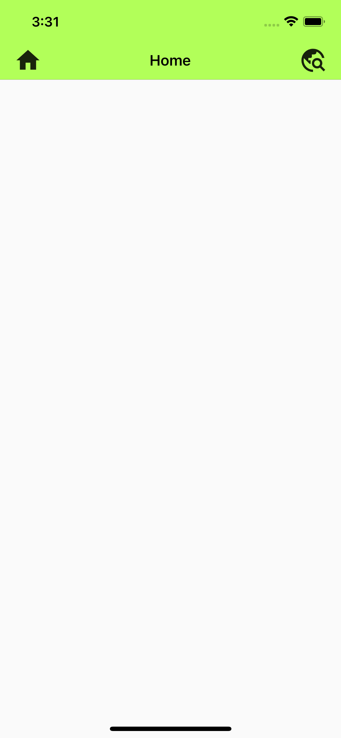
An iOS-styled navigation bar.
The navigation bar is a toolbar that minimally consists of a widget, normally a page title, in the middle of
the toolbar.
Some properties of CupertinoNavigationBar Class:
The background color of the navigation bar. If it contains transparency, the tab bar will automatically produce a blurring effect to the content behind it.
Widget to place at the start of the navigation bar. Normally a back button for a normal page or a cancel button for full page dialogs.
Widget to place in the middle of the navigation bar. Normally a title or a segmented control.
Widget to place at the end of the navigation bar. Normally additional actions taken on the page such as a search or edit function
Example :
Scaffold(
appBar: CupertinoNavigationBar(
backgroundColor: Colors.lightGreenAccent,
leading: Icon(Icons.home),
middle: Text("Home"),
trailing: Icon(Icons.travel_explore),
),
)
