Date Picker
- The showDatePicker function
- Example :
- Prepare a variable :
- Setup UI
- Write a Method to call showDatePicker function
- Display only a specific date range
- Show the Text input box instead of the calendar
- Show the year’s list first
- Change the Text and the error messages.
- Change the label and hint text
- Open native-like DatePicker in the Target platform
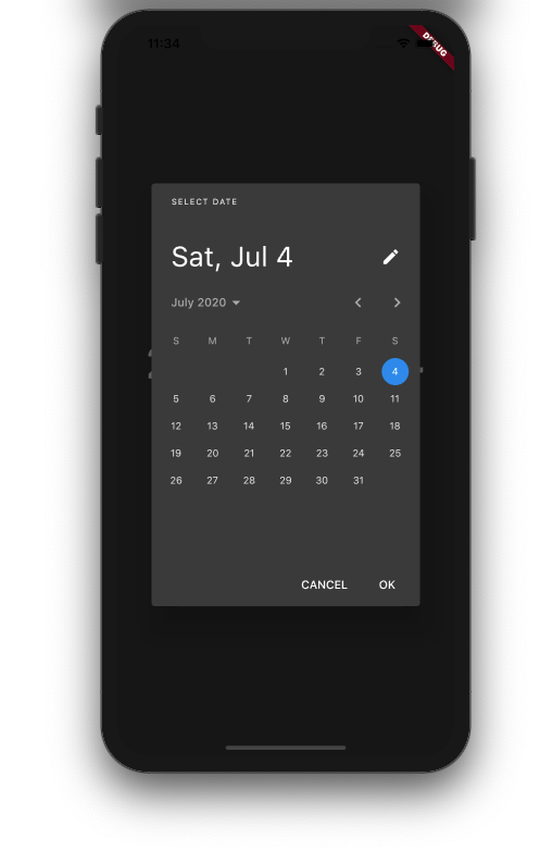
Shows a dialog containing a Material Design date picker.
Basic Code :
showDatePicker(
context: context,
initialDate: DateTime.now(),
firstDate: DateTime(2000),
lastDate: DateTime(2025),
);
DateTime selectedDate = DateTime.now();
Column(
mainAxisSize: MainAxisSize.min,
children: <Widget>[
Text(
"${selectedDate.toLocal()}".split(' ')[0],
style: TextStyle(fontSize: 55, fontWeight: FontWeight.bold),
),
SizedBox(
height: 20.0,
),
RaisedButton(
onPressed: () => _selectDate(context), // Refer step 3
child: Text(
'Select date',
style:
TextStyle(color: Colors.black, fontWeight: FontWeight.bold),
),
color: Colors.greenAccent,
),
],
),
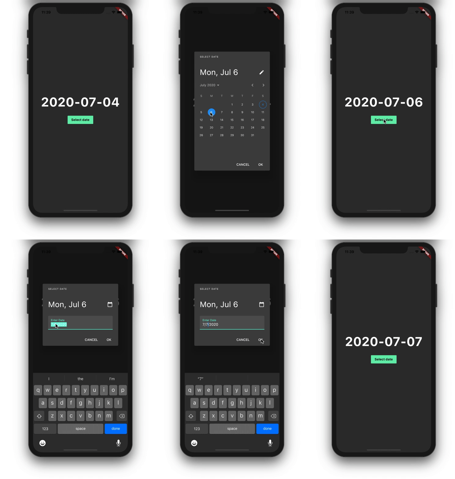
A minimal UI consists of Text to show date and RaisedButton to open DatePicker dialog.
_selectDate(BuildContext context) async {
final DateTime? picked = await showDatePicker(
context: context,
initialDate: selectedDate, // Refer step 1
firstDate: DateTime(2000),
lastDate: DateTime(2025),
);
if (picked != null && picked != selectedDate)
setState(() {
selectedDate = picked;
});
}
This method actually calls showDatePicker function and waits for the date selected by the user. If a user does not select anything then the date return will be null otherwise the selected date.
Note :
The initialDate property is used to display a default date when DatePicker dialog is
opened.
SetState will be called to update the selected date in UI and you are done.
We need to set the firstDate and the lastDate properties :
showDatePicker(
context: context,
initialDate: selectedDate,
firstDate: DateTime(2000), // Required
lastDate: DateTime(2025), // Required
);
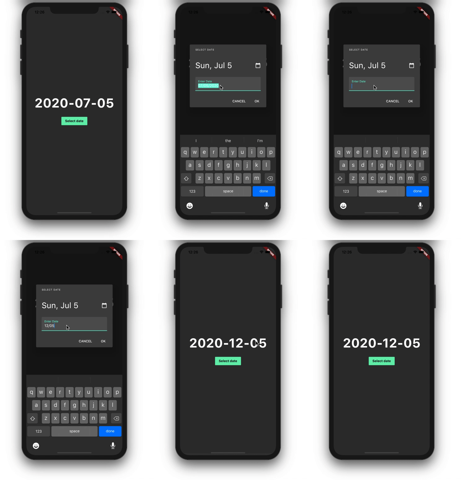
Sometimes it becomes difficult for old age people to interact with the calendar for changing the dates
especially when they use it for the first time.
In such a situation it is better to just provide an input box to enter the date, and this can be done very
easily just by setting initialEntryMode property.
showDatePicker(
context: context,
initialDate: selectedDate,
firstDate: DateTime(2000),
lastDate: DateTime(2025),
initialEntryMode: DatePickerEntryMode.input,
);
Sometimes you are very sure that the user will enter the date from the past years like date of birth, In
such a case you can directly show the year’s list instead of showing a list of days then making users open
the year list.
Setting initialDatePickerMode to DatePickerMode.year will do the work.
This will save one-click for users,
which is good.
showDatePicker(
context: context,
initialDate: selectedDate,
firstDate: DateTime(2000),
lastDate: DateTime(2025),
initialDatePickerMode: DatePickerMode.year,
);

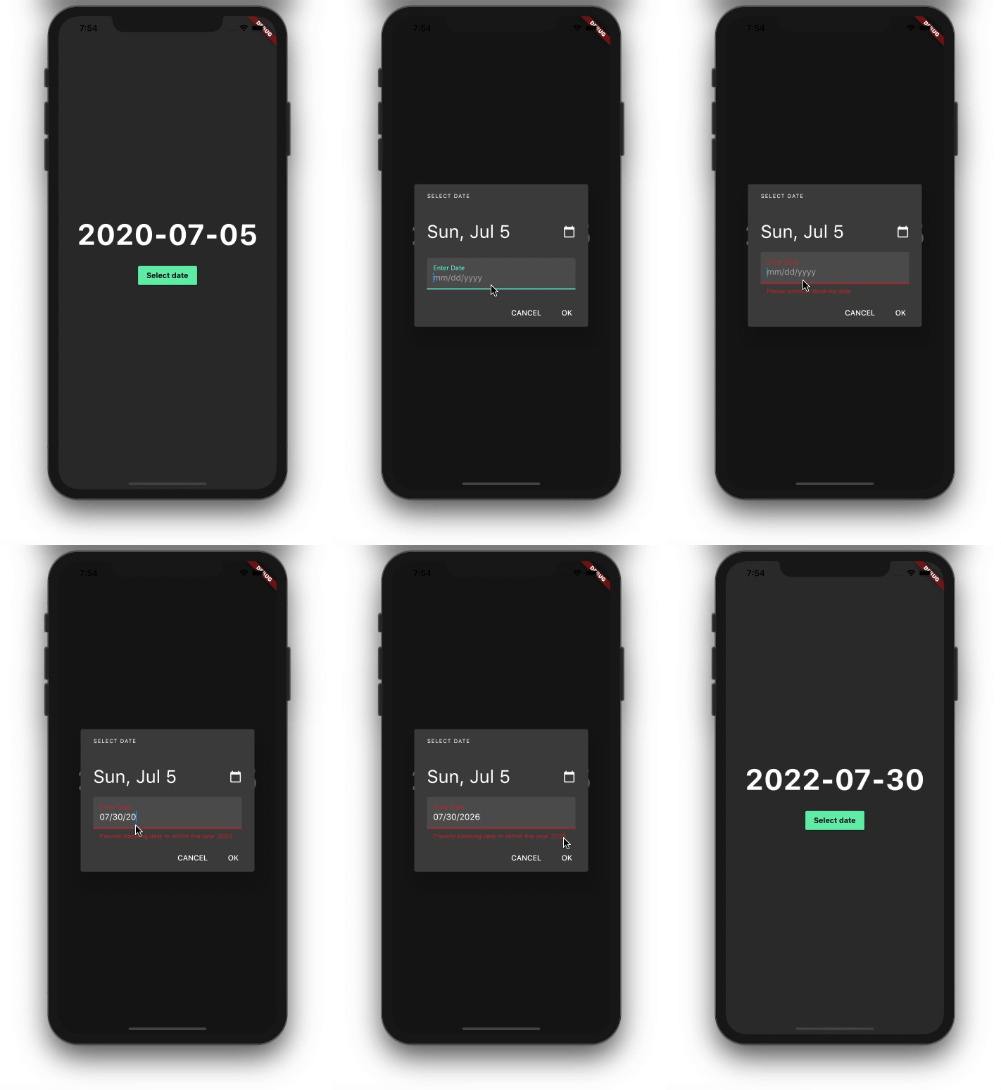
These highlighted texts can be changed very easily by setting below properties.
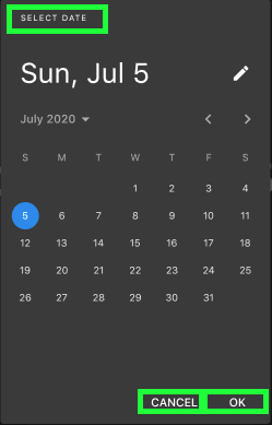
When the user tries to enter the date via text input box, there is a high chance of making a mistake like
giving an invalid date.
By default, this widget provides some predefined error text but you can always change it if you want in a
case like assisting users what to do next instead of just showing the message.
showDatePicker(
context: context,
initialDate: selectedDate,
firstDate: DateTime(2000),
lastDate: DateTime(2025),
helpText: 'Select booking date', // Can be used as title
cancelText: 'Not now',
confirmText: 'Book',
errorFormatText: 'Enter valid date',
errorInvalidText: 'Enter date in valid range'
);
showDatePicker(
context: context,
initialDate: selectedDate,
firstDate: DateTime(2000),
lastDate: DateTime(2025),
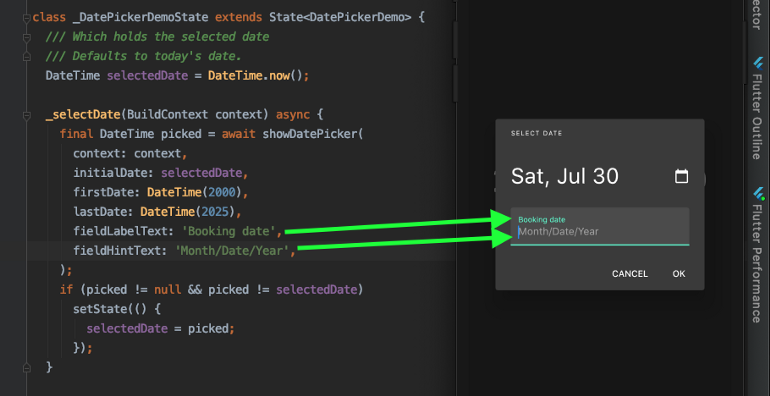
fieldLabelText: 'Booking date',
fieldHintText: 'Month/Date/Year',
);
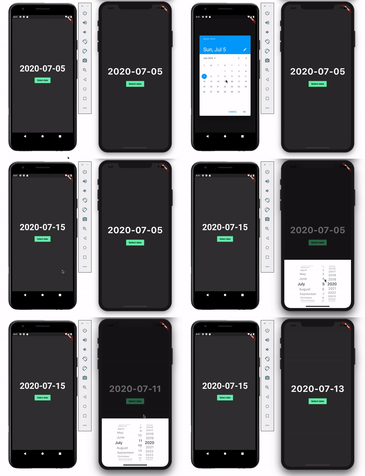
If you have noticed carefully that we have kept on opening Material design date picker in the iOS device! so
how do we go for Cupertino Datepicker in iOS?
We just need to check which target platform it is and show the respective DatePicker and yes Flutter has
also covered the CupertinoDatePicker.
import 'package:flutter/cupertino.dart';
import 'package:flutter/material.dart';
import 'package:flutter/foundation.dart';
void main() {
runApp(const MyApp());
}
class MyApp extends StatelessWidget {
const MyApp({Key? key}) : super(key: key);
@override
Widget build(BuildContext context) {
return MaterialApp(
title: 'DatePicker',
theme: ThemeData(
primarySwatch: Colors.blue,
),
home: const MyHomePage(),
);
}
}
class MyHomePage extends StatefulWidget {
const MyHomePage({Key? key}) : super(key: key);
@override
State<MyHomePage> createState() => _MyHomePageState();
}
class _MyHomePageState extends State<MyHomePage> {
DateTime selectedDate = DateTime.now();
@override
Widget build(BuildContext context) {
buildMaterialDatePicker(BuildContext context) async {
final DateTime? picked = await showDatePicker(
context: context,
initialDate: selectedDate,
firstDate: DateTime(2000),
lastDate: DateTime(2025),
builder: (context, child) {
return Theme(
data: ThemeData.light(),
child: child!,
);
},
);
if (picked != null && picked != selectedDate) {
setState(() {
selectedDate = picked;
});
}
}
buildCupertinoDatePicker(BuildContext context) {
showModalBottomSheet(
context: context,
builder: (BuildContext builder) {
return Container(
height: MediaQuery.of(context).copyWith().size.height / 3,
color: Colors.white,
child: CupertinoDatePicker(
mode: CupertinoDatePickerMode.date,
onDateTimeChanged: (picked) {
if (picked != selectedDate) {
setState(() {
selectedDate = picked;
});
}
},
initialDateTime: selectedDate,
minimumYear: 2000,
maximumYear: 2025,
),
);
});
}
_selectDate(BuildContext context) async {
switch (Theme.of(context).platform) {
case TargetPlatform.android:
case TargetPlatform.fuchsia:
case TargetPlatform.linux:
case TargetPlatform.windows:
return buildMaterialDatePicker(context);
case TargetPlatform.iOS:
case TargetPlatform.macOS:
return buildCupertinoDatePicker(context);
}
}
return Scaffold(
backgroundColor: Colors.teal,
body: Center(
child: Column(
mainAxisSize: MainAxisSize.min,
children: <Widget>[
Text(
"${selectedDate.toLocal()}".split(' ')[0],
style: const TextStyle(fontSize: 55, fontWeight: FontWeight.bold),
),
const SizedBox(
height: 20.0,
),
TextButton(
onPressed: () => _selectDate(context), // Refer step 3
child: const Text(
'Select date',
style:
TextStyle(color: Colors.black, fontWeight: FontWeight.bold),
),
),
],
),
),
);
}
}
Sources :
A Deep Dive
Into DatePicker In Flutter
showDatePicker function